A great yearbook cover design feels like a warm welcome. It should say, “This is our year,” at a quick look. In 2026, school yearbook trends lean modern and personal. Students love bold themes, clean type, and real emotion. Teachers want clarity, school pride, and timeless quality, too. So we are aiming for both style and meaning. I have helped schools plan covers that print beautifully. I have also seen what students actually keep and share. The best covers are simple, but never boring. They also match your inside pages and your story. This guide gives you ideas that feel fresh for 2026. You will also get practical tips for smooth production. Each idea below can fit any grade level. You can adapt them for clubs, sports, or whole schools. You can also combine two ideas into a single custom concept. That is how many custom yearbook covers become unforgettable. Let’s get you a cover students will love to hold. And yes, one that looks great in photos, too.
Quick Checklist For A Cover That Prints Perfectly
A cover can look amazing on a screen. Then it can fail in print if details are missed. So let’s keep your design safe and sharp. This is the same checklist I use with school teams. It keeps stress low and results high. It also supports a modern yearbook layout inside. Start with your school name and year. Keep them clear from a few feet away. Choose one main idea, not five competing ideas. Use two fonts, or at most three. Leave breathing room around edges and corners. Printers need safe zones for trimming and binding. Pick colours that match your school brand. But do not fear one bold accent colour. Make sure contrast is strong for readability. Think about fingerprints and wear on dark covers. Ask for a print proof if the budget allows. That one step saves so many surprises.

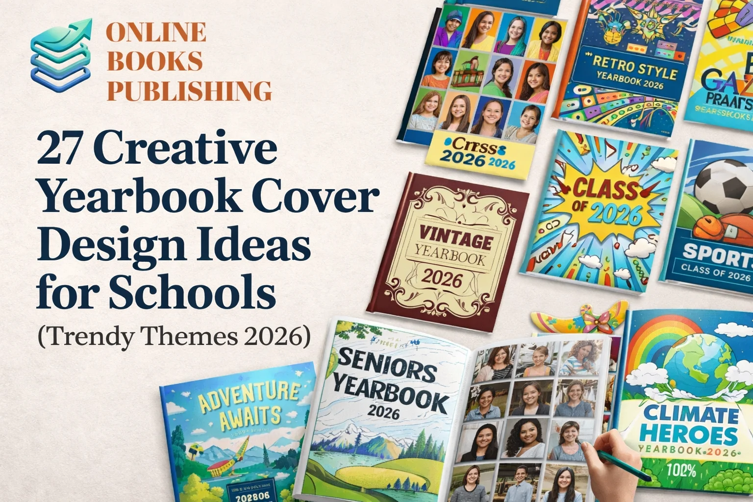
27 Creative Yearbook Cover Ideas For Trendy Schools In 2026
1) “We Are The Story” Editorial Cover
This concept feels like a magazine cover. Use one hero photo that shows real student energy. Add clean headlines that hint at inside sections. Keep the text minimal and easy to scan. This is perfect for high school yearbook cover ideas. It feels grown up and proud, without being stiff. Choose one photo with strong light and motion. Sports, drama, or hallway candid shots work well. Use bold type for the school name at the top. Add small captions like “Highlights,” “Voices,” and “Moments.” This style supports many yearbook cover designs today. It also pairs nicely with a modern yearbook layout.
2) “Time Capsule 2026” Retro Sticker Collage
Think of a laptop covered in stickers. Now turn that vibe into your cover yearbook design. Use illustrated stickers for clubs, jokes, and school life. Add tiny dates and mini captions for extra charm. Students love this because it feels personal. It also works for middle school and high school. Make the stickers school safe and inclusive. Avoid private jokes that could exclude groups. Use a consistent line style to make it look professional. Mix icons with small photos for a hybrid look. This theme fits creative yearbook themes really well. And it looks fun even from across the room.
3) “Neon Night” Glow Lines On Dark Background
This is bold, modern, and easy to love. Use a deep navy or charcoal background. Add neon line art, such as stars, waves, or city shapes. Then place your title in a bright glow effect. It screams 2026 without trying too hard. It also photographs beautifully for social posts. Keep neon colours limited to two or three. Too many neon shades can feel chaotic. Use thick enough strokes for print clarity. Add subtle texture to make the dark area feel rich. This idea fits current school yearbook trends. It also instantly makes your yearbook feel premium.
4) “Minimal Monogram” School Initials As Art
Sometimes less truly is more. Use your school initials as the main graphic element. Make the letters bold, oversized, and centred. Add the year in a clean, simple font. This feels modern, classy, and timeless. It is a safe option that still looks strong. Try embossing or spot UV on the initials. That adds texture without adding clutter. Use your school colours with lots of white space. This can be the best choice for tight deadlines. It fits many yearbook cover designs easily. And it keeps focus on the school identity.
5) “Community Quilt” Patchwork Of Student Life
This cover tells a “together” story. Create patchwork blocks in a quilt or grid pattern. Each block shows a club, sport, or moment. Use photos, icons, and simple patterns in each block. It feels warm, friendly, and very school-focused. It also helps include many student groups. Use a consistent border or frame for each block. That keeps the layout clean and modern. Choose a limited palette that matches the school’s branding. Add one central label block for your title. This is great for custom yearbook covers. It also supports a balanced modern yearbook layout.
6) “The Map Of Our Year” Campus Or Town Outline
Students connect with places they know. Use a simple map outline of your campus. Or use your town shape with school landmarks marked. Then sprinkle small icons for key memories. This is unique and very meaningful. It feels local in the best way. Keep map lines clean and not too thin.
Add the school name as a path label—Mark locations like gym, library, and auditorium. Use tiny photo thumbnails near key spots. This is a smart choice for a yearbook cover design. It also works well for schools of any size.
Add the school name as a path label—Mark locations like gym, library, and auditorium. Use tiny photo thumbnails near key spots. This is a smart choice for a yearbook cover design. It also works well for schools of any size.
7) “The Year In One Word” Bold Typography
Pick one word that defines the year. Words like “Rise,” “Together,” or “Change” work well. Make it huge and centred on the cover. Then place smaller supporting words around it. This creates instant emotion and clarity. It is also easy to design on a budget. Choose a word that fits your school culture. Ask students to vote on options to build buy-in. Use thick font weight for print reliability. Add subtle background texture like paper or grain. This approach fits well with yearbook cover designs. It also feels authentic when students choose the word.
8) “Photo Window” Cutout Frame With A Hidden Image
This one feels interactive and premium. Use a big frame shape on the cover. Inside the frame, place a bold photo moment. The rest of the cover stays clean and minimal. It gives focus without needing many elements. It also suits a modern yearbook layout. Try a geometric window, such as a circle or an arch. You can even match your school mascot’s shape. Use the frame as a repeating motif inside pages. Keep the title aligned with the window edge. This is a clean approach to yearbook cover design. And it looks great with matte lamination.
9) “Chromatic Gradient” Smooth Colour Fade
Gradients are back, but calmer. Use a smooth blend of two school colours. Or use a sunrise gradient for hope and energy. Add simple white text for strong contrast. This feels trendy without being loud. It also works well across many grade levels. Make sure your gradient is high resolution. Banding can happen if the file is weak. Test print a small sample before final approval. Add minimal line art for a modern touch. This fits school yearbook trends for 2026. It also pairs well with clean section dividers inside.
10) “Polaroid Pile” Stacked Instant Photos
Students love that candid photo feeling. Create a pile of Polaroid-style frames on the cover. Inside each frame, place a key memory photo. Use a few handwritten-style notes on the frames. It feels friendly, casual, and real. This is perfect for creative yearbook themes. Keep the frames at varied angles for energy. But do not over-tilt, or it feels messy. Use five to nine photos for a clean balance. Pick photos with bright faces and clear action. This works great for yearbook cover designs in schools. It also invites students to open the book fast.
11) “Yearbook As A Playlist” Music-Themed Cover
If your school loves music, go for this. Design the cover like a streaming playlist screen. Use “tracks” as chapter names or school events. Add a faux progress bar and simple icons. It feels fun and very 2026. It also supports your inside organisation. Use readable fonts and keep icons simple. Avoid using real app logos. You can mimic the style without copying a brand. That keeps you safer with school rules and rights. This is a playful cover yearbook design option. And it connects instantly with students.
12) “Comic Panel Moments” Pop Culture Friendly Layout
Create three to six comic-style panels. Each panel shows a different school moment. Add simple speech bubbles with short quotes. Use bold outlines and bright accent colours. It feels energetic and easy to scan. It also gives a strong storytelling feel. Keep quotes kind and inclusive. Avoid teasing language that could hurt someone. Use consistent panel spacing for a modern yearbook layout. Pick photos that already feel expressive and dynamic. This fits many yearbook cover designs today. And it makes the cover feel like a mini story.
13) “Future Headlines” Newspaper Style With A Twist
Design the cover like a front page. Use headlines about wins, events, and milestones. Add a big central photo like a feature story. Include small “sections” like sports, arts, and student life. It is nostalgic and still fresh for 2026. It also works across different school types. Use a clean serif or a modern slab font. Keep columns aligned to look intentional. Avoid too much tiny text that will blur. Add one bold colour bar for modern energy. This is great for yearbook cover designs with structure. It also helps readers expect a story-driven book.
14) “Holographic Dream” Foil With Simple Icons
Foil can make a cover feel special. Use holographic foil for the title or mascot outline. Keep the rest of the cover simple and matte. That contrast looks premium and modern. Students often love shiny details for keepsakes. It also fits 2026 trend vibes. Work with your printer early for foil settings. Foil placement needs an exact file setup. Use thick shapes for foil so it prints cleanly. Avoid tiny foil text that may fill in. This supports custom yearbook covers very well. And it adds value without adding clutter.
15) “Nature Meets Tech” Organic Shapes With Clean Type
This theme blends calm and modern energy. Use soft leaf shapes, water lines, or clouds. Then layer clean geometric shapes over them. Add your title in strong, simple typography. It fits the “balance” mood many schools want. It also works well for eco clubs and STEM. Use muted colours with one bright accent. Keep the shapes large and uncluttered. Add subtle pattern texture for depth in print. Match the inside section pages to the same style. This fits nicely with school yearbook trends for 2026. And it feels fresh without being too loud.
16) “Mascot Spotlight” Bold Mascot As A Hero Graphic
Let your mascot shine in a new way. Use a simplified mascot illustration, not a busy one. Place it in the centre with a bold background shape. Add the year and school name with confidence. This feels proud and easy to recognise. It also sells well to parents and alums. Avoid overly aggressive expressions for younger schools. Aim for friendly strength and school spirit. Use school colours with one modern shade twist. Try adding a subtle shadow for depth. This is a strong yearbook cover design for spirit. It also works great with a matching spine and back cover.
17) “Skyline Of Achievements” Icons As A City
Build a skyline of school-life icons. Use books, balls, notes, and lab tools as buildings. Place the skyline along the bottom of the cover. Add a sky gradient or star pattern above it. It feels both creative and meaningful. It also includes many student interests. Keep icons consistent in style and line weight. Use enough spacing so the skyline stays clear. Add the title above the skyline for balance. You can hide tiny Easter eggs for student fun. This fits creative yearbook themes very well. It also feels unique among typical yearbook cover designs.
18) “Snapshots In Letters” Photos Inside The Title
This is simple and smart. Write your school name or “Yearbook” in big letters. Fill each letter with a photo collage texture. Keep the background plain for contrast. It becomes both typography and memory at once. It also reads well from a distance. Choose photos with similar lighting for unity. Avoid overly dark images inside the letters. Add a thin outline around letters for crisp edges. Use high resolution so the print stays sharp. This is a popular cover yearbook design option. It also blends nicely with a modern yearbook layout inside.
19) “Our Fingerprints” Handprints Or Thumbprint Pattern
This idea feels personal and community-driven. Collect student thumbprints or handprints on paper. Scan them and turn them into a repeating pattern. Use one colour for a clean, modern look. Add the title in bold type over the pattern. It creates ownership and pride across the school. Get permission and follow school privacy rules. Do not connect prints to names on the cover. Use the pattern as a background, not the whole story. Add one simple icon or mascot mark for balance. This is great for custom yearbook covers. It also signals togetherness without needing many photos.
20) “The Big Number” 2026 As The Main Graphic
Make “2026” the hero of the cover. Use bold numbers, large and centred. Fill the numbers with a subtle pattern or photo texture. Keep everything else clean and minimal. This looks modern and trendy right away. It also stays timeless over the years. Use a thick font so the number reads well. Try embossing the numbers for a premium feel. Add the school name in smaller text under it. Use your school colours with strong contrast. This fits yearbook cover designs that feel modern. And it is easy for a student team to execute.
21) “Library Card” Vintage Academic Theme
This feels cosy and classic. Design the cover like an old library checkout card. Add fields like “Name,” “Grade,” and “Year.” Use school-friendly stamps and small icons. It taps into nostalgia while staying playful. It also fits schools with a strong academic identity. Keep the layout clean and readable. Use one or two ink colours for a true vintage feel. Add a subtle paper texture for warmth. Avoid copying real library logos or marks. This is a charming idea for a yearbook cover design. It also supports a storytelling tone inside the book.
22) “Puzzle Pieces” Each Piece Represents A Group
Use a puzzle theme for unity and diversity. Create large puzzle pieces across the cover. Fill pieces with photos, patterns, or school colours. Place the title where pieces meet for a strong structure. This message is simple and easy to understand. It also encourages inclusion across student groups. Use clean edges and avoid tiny puzzle details. Too many pieces can make the print look busy. Pick five to twelve pieces for balance. Add a short tagline like “Many parts, one year.” This fits yearbook cover designs with a community focus. It also pairs well with section dividers shaped like pieces.
23) “Season Wheel” A Circle Of The School Year
This cover shows your year as a cycle. Use a circle split into seasons or event periods. Place photos or icons in each section of the circle. Add your title in the centre of the circle for focus. It looks modern and organised at the same time. It also helps preview the book’s structure. Use consistent spacing and clean lines for clarity. Keep the circle thick enough for print sharpness. Use small captions like “Fall,” “Winter,” and “Spring.” Avoid too much text inside small wedges. This is a strong modern yearbook layout concept. It also works great for schools with many annual events.
24) “Golden Hour” Warm Photo With Soft Type
Pick one amazing photo in warm sunlight. A cheering crowd or smiling group works well. Use soft, clean typography over the image. Add a light overlay if text needs more contrast. This cover feels emotional and timeless. It is also easy for audiences to connect with. Choose a photo with clear faces and a simple background. Avoid overly busy scenes that distract from the title. Use a font that stays readable on textured images. Keep text short and place it in open space. This approach supports yearbook cover designs focused on feeling. It also fits many high school yearbook cover ideas and styles.
25) “Geometric School Pride” Shapes In School Colours
This is great for a clean, trendy look. Use triangles, circles, and blocks in school colours. Layer them in a modern pattern with depth. Then add a simple type for the school name and year. It feels sporty, modern, and easy to print. It also looks great with a matte finish. Keep shapes large so the cover stays readable. Use one accent colour to create a focal point. Add subtle shadowing, but avoid heavy effects. Match the inside headers to the same shape language. This is a flexible cover yearbook design option. It also helps unify your full book design system.
26) “Class Of Voices” Quotes Pattern With Clean Focus
This cover uses real student words as texture. Collect short positive quotes from many students. Use them as a background pattern in light text. Then place the main title in bold above it. It feels real, human, and community-driven. It also supports E.E.A.T. with authentic voices. Keep quotes short and kind. Avoid any quote that targets a person or group. Get staff approvals for safety and policy. Use strong contrast so the title stays readable. This works well for yearbook cover designs with meaning. It also encourages students to feel represented on the cover.
27) “Augmented Reality Marker” Scan-To-See Surprise
This is a fun 2026 upgrade. Add a small scan marker on the cover. When scanned, it shows a video or highlight reel. Keep the marker small and the design clean. It makes the yearbook feel interactive and modern. Students love showing it to friends and family. Work with a trusted vendor or school tech team. Test it on multiple phones before final printing. Make sure the link is stable for years. Also, provide a short URL inside the book. This is a bold school yearbook trend. And it can make your yearbook stand out instantly.
How To Choose The Right Theme For Your School
It is tempting to pick the coolest cover fast. But the best choice fits your story and resources. Start by asking what defined your year. Was it sports, arts, growth, change, or unity? Then think about your audience and school culture. Middle schools often want playful, bright energy. High schools often want sleek, modern confidence. Next, check your budget and printing options. Foil, embossing, and spot UV cost extra. But they can be worth it if planned early. Also, think about your team’s design skill level.
Some yearbook cover designs need advanced photo editing. Others are simple and still look premium. Pick what your team can do well, not just big. Finally, match the cover to the inside design. Your modern yearbook layout should feel connected. Use the same fonts, icons, or colour system. That creates a strong “brand” for your yearbook. It also makes the whole book look professional. And it helps readers feel the story flow.
Practical Tips For Photos, Fonts, And Printing
Let’s keep your cover looking great in print. Use high-resolution photos, not social media downloads. Ask your photographer for original files when possible. Aim for sharp faces and clear lighting. Avoid heavy filters, as they can cause muddy prints. A clean edit always looks more professional. Choose fonts that stay readable at small sizes.
Avoid super-thin fonts for printed covers. Limit yourself to two font families most of the time. Use spacing and alignment to create a modern feel. Also, keep a safe margin near the edges. Binding and trimming can cut important details. For colour, use strong contrast. Light text on light photos will print poorly. Ask your printer about colour settings and profiles. Request proof if you can afford it. That proof is your best quality check. It protects your work and your budget, too.
Simple Ways To Add E.E.A.T. To Your Yearbook Cover Process
E.E.A.T. is about trust and real experience. For a yearbook, it means responsible design decisions. Use real student content with clear permissions. Credit photographers and artists inside the book. Avoid unlicensed characters, logos, and brand designs. That helps protect your school and your staff. Show your process in a small inside page.
Include “Cover designed by” with student names. Add your theme story and why you chose it. Mention how student votes shaped the theme. That builds authenticity and real authority. It also makes students feel proud and included. Most of all, keep your cover inclusive. Represent the full school, not one circle. Use language that welcomes every student group. Check for cultural sensitivity in images and symbols. These steps raise quality and reduce complaints later. They also strengthen your book’s long-term value.
FAQs About Yearbook Cover Design
What is the best size for cover elements?
Design for readability from a distance. Keep your school name large and simple. Avoid tiny text that will blur in print. Use generous spacing around your key elements. Printers also need safe zones for trimming and binding. Ask your vendor for a cover template early. That template prevents edge cuts and alignment issues. It also helps your cover yearbook design stay accurate.

How many photos should a cover use?
One strong photo can be enough. Three to nine photos can work in a collage. More than that, it often looks busy and unclear. Choose photos that share similar lighting and mood. That creates unity and a modern yearbook layout feel. Also, avoid photos that exclude many student groups. Try to balance representation across activities and grades. That keeps your yearbook cover designs more inclusive.
Can we use popular characters or brand logos?
It is safer to avoid them. Most characters and logos are protected by copyright. That can create legal and policy problems. Instead, create original icons or student-made art. You can still match the vibe without copying. Use creative, school-owned yearbook themes. That also keeps your yearbook feeling unique and authentic. Original work supports trust and long-term pride.
Final Thoughts: Your Cover Can Be Trendy And Timeless
Your yearbook cover is your first hello. It should feel like your school in one glance. The best yearbook cover design is clear, warm, and confident. Trendy themes can still feel timeless with simple choices. Focus on one strong idea and strong readability. Then support it with clean type and smart spacing.
Use this list as your creative launchpad. Pick one theme, then customise it with your story. That is how custom yearbook covers become meaningful keepsakes. If you want, tell me your school type and colours. I can suggest the best three themes for your vibe. And I can help you shape a modern yearbook layout, to

We help authors bring their stories to life through professional online book publishing services. From manuscript formatting and cover design to Amazon KDP publishing and global distribution, we make self-publishing simple, affordable, and successful.