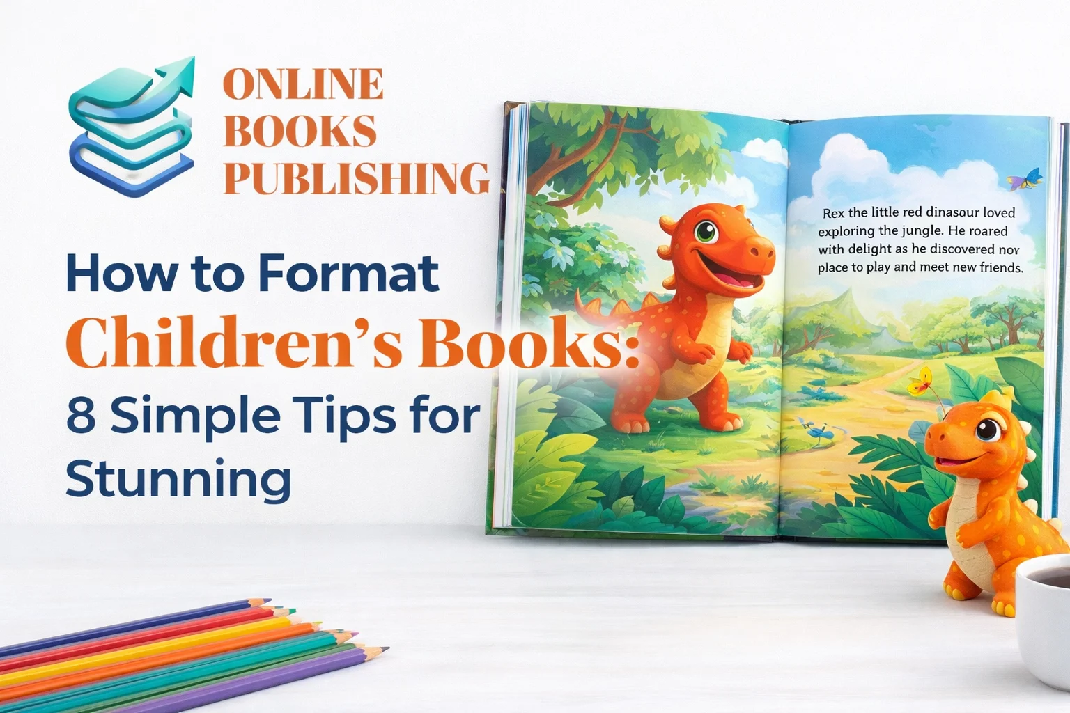
Formatting childrens books can feel confusing at first. You have words and pictures together. You have page turns and pacing too. You also have trim size and bleed rules. That sounds like a lot, right. But it gets easier fast. You just need a clear plan. You need the right file setup. You also need simple layout habits. This children’s book formatting guide will walk with you. I will keep it friendly and practical. You will learn children’s book layout basics step by step. You will also avoid common printing surprises.
Why formatting matters for childrens books
Kids notice messy pages quickly. Parents notice them even faster. Teachers notice them during read aloud time. Librarians notice them on the shelf too. Good formatting helps everyone. It makes reading smooth and fun. It also makes your book look professional. That matters for trust and sales. It also matters for reviews. Formatting illustrated childrens books is not like novels. Pictures control the page. Text must fit the art. Page turns must feel natural. Printing rules also matter more here. So learning how to format a children’s book is worth it.
What “formatting” means in childrens books
Formatting is more than font choice. It is full book layout work. It means placing text on pages. It means placing illustrations on spreads. It means setting margins and bleed. It means choosing trim size and orientation. It also means exporting a print-ready PDF. For ebooks, it can mean fixed layout. That is common for picture books. So formatting is the bridge. It connects your story and your art. It also connects your files to a printer. When you learn children’s book page layout, you learn control. You reduce errors and rework. You also save money on proof copies.
Before you start, gather your essentials
This part saves the most time later. Please do not skip it. First, finalize your text. Small text edits can break page spacing. Second, gather final illustration files. Make sure sizes match your trim plan. Third, make a book dummy for picture books. This is a simple page mockup. It shows where text will go. It also shows page turns. A storyboard for childrens books works the same way. You can do it with paper folds. You can also do it digitally. This step makes formatting calmer. It also prevents guessing inside your software.
Step-by-step setup for your layout file

Now we start the practical setup. Choose your trim size first. Decide portrait, square, or other. Then decide if you need bleed. Many picture books use full bleed art. If any page bleeds, set bleed for all pages. Next, set margins and a safe area. This keeps text away from trims. Also set a gutter for binding. That is the inner margin. This setup is the base of how to prepare a children’s book for printing. When your base is right, everything fits. When it is wrong, everything fights you. So take your time here. It pays you back later.
Tip 1: Choose the right page count
Picture books often use 32 pages. That is a common standard. It matches typical print signatures. It also matches reader expectations. But you can choose other counts. Just stay in multiples of eight. Think 24, 32, 40, or 48. This keeps printing smooth. It can also keep cost lower. Remember, covers are separate files. Your interior page count is inside only. Also remember title pages and copyright pages count too. Plan those pages early. Your book dummy will help here. This is part of children’s book page count standards. It makes your layout predictable.
Tip 2: Keep word count friendly for read aloud
Modern picture books are short. Many are under 500 words. Some are even shorter. Short text helps pacing. It also helps page turns feel clean. It helps parents read smoothly. It helps teachers keep attention. If your text is long, spacing gets harder. You may crowd pages with tiny fonts. That hurts readability. So edit for tight language. Use simple words and strong rhythm. This supports word count for children’s picture books. It also supports better design. When text is light, art can breathe. When art breathes, your book looks premium. That is a win for everyone.
Tip 3: Pick trim size and orientation early
Trim size controls your entire design. It tells the illustrator what to draw. It tells you how text can sit. It also tells printers what to cut. So decide before you finalize art. Portrait and square are popular for POD. POD means print on demand services. Amazon KDP and IngramSpark are common POD options. They offer many portrait and square sizes. Landscape options can be limited on POD. So check availability before you lock it. This is picture book printing requirements work. It prevents surprise reformatting later. A common safe choice is 8×8. Another is 8.5×8.5. Portrait 8.5×11 is also common.
Tip 4: Understand bleed, and set it correctly
Bleed means art goes past the page edge. It gets trimmed during printing. That prevents white lines at edges. Bleed makes picture books feel immersive. Many parents love that look. Many publishers use it too. But bleed needs correct file size. Your document size becomes larger than trim. That extra space is the bleed area. You also need a safe area inside. Text should never touch the trim edge. Use bleed settings for picture books in your software. Keep important art away from trim too. Faces and hands need breathing room. This tip alone prevents many reprints. It is central to margins and bleed for picture books.
Tip 5: Use strong margins and a clear safe zone
Margins are your safety net. They protect text and key art. They also protect against binding shift. This is common in paperbacks. The inner edge can eat details. So set a gutter margin. It should be bigger than outer margins. A simple starting point works well. Many creators use about 0.375 inches for gutters. They use 0.375 to 0.5 for other sides. Bigger is often safer. It also looks cleaner. This creates a calm page layout. It helps children focus on text. It also helps parents read aloud easily. When you follow picture book margins, you prevent cut off words. You also prevent sad proof surprises.
Tip 6: Place text and illustrations with rhythm
This is where the magic happens. You are building the reading experience. Use your book dummy as your map. Start by placing full spread art. Then place text blocks carefully. Keep text away from busy art areas. Avoid placing text on dark textures. Use contrast for easy reading. Leave space around text blocks. That space helps calm the page. Also keep text consistent across pages. Use similar placement patterns when possible. Kids like predictability. Parents like readability. This is placing text and illustrations in picture books. It is also pacing work. Use page turns for surprise. Use spreads for big moments. Keep quiet moments less crowded. This is children’s book page layout done well.
Tip 7: Choose readable fonts and simple text styling
Fonts matter a lot for kids. Avoid fancy scripts for main text. Choose a clean and friendly font. Use a larger size than novels. Many picture books use 16 to 24 point sizes. It depends on your page and font. Keep line spacing comfortable. Avoid tight leading. Avoid too many font changes. Use one main font. Use one accent font if needed. Keep it simple and consistent. Also avoid Times New Roman for picture books. It can feel too formal. It can also look small. Your goal is easy reading. That helps parents and teachers. It also supports children’s publishing standards. Always test print a sample page. Read it from arm distance. That tells the truth.
Tip 8: Export a print-ready PDF the right way
Now you finish like a pro. Export settings matter a lot. Choose the right page size with bleed. Include crop marks only if required. Many POD platforms do not want crop marks. Check your platform rules carefully. Embed fonts in the PDF. Use high quality images. Keep them at 300 DPI if possible. Do not compress too much. Make sure pages are in correct order. Also check color handling. Many printers accept RGB fine. Some workflows prefer CMYK. Follow your platform guide.
This is how to format a picture book for print properly. This also supports print-ready PDF for childrens books. Always open your PDF after export. Zoom in and check edges. Check text sharpness too. Then upload and order a proof.
Quick checklist you can follow every time
This children’s book formatting checklist keeps you steady. First, lock your final story text. Second, confirm final illustration sizes. Third, choose trim size and bleed plan. Fourth, set margins and gutter space. Fifth, build pages using your dummy map. Sixth, check safe zones on every page. Seventh, verify image resolution and placement. Eighth, export a print-ready PDF carefully. Ninth, review the PDF page by page. Tenth, order a proof and inspect it. This checklist supports children’s book production process work. It also reduces stress. It also reduces client revisions. Keep it saved for future books. You will thank yourself later.
Best tools for format childrens books
You have several solid options. The best choice depends on your skill. It also depends on your budget. It also depends on your book type. If your book is fully illustrated, choose a layout tool. If it is mostly text, simpler tools can work. But picture books need control. You need bleed and safe guides. You need precise text boxes. You need export control too. So tool choice matters. Below are friendly notes on common tools. I will keep it honest and simple. This helps you choose children’s book design software without confusion.
Adobe InDesign for children’s books
InDesign is the industry standard. It gives you deep control. You can place art precisely. You can manage text styles cleanly. You can set bleed and margins easily. You can build consistent templates too. It also exports strong print PDFs. Many professional designers use it daily. The downside is the learning curve. It can feel big at first. But tutorials help a lot. If you plan many books, it is worth learning. It also helps if you offer services. It supports professional children’s book design workflows. It also supports IngramSpark children’s book formatting needs. If you want the most control, this is it.
Affinity Publisher and similar tools
Affinity Publisher is a popular alternative. It is often cheaper than Adobe. It has strong layout features. It supports bleed and guides. It can handle images well too. Many indie authors love it. It also works great for picture book layout design. The learning curve is still there. But it can feel friendlier than Adobe. If you want pro control without subscription cost, consider it. You can also pair it with Affinity Photo. That helps with image edits. Keep your workflow organized. Use file naming that is clear. Use version numbers too. That saves headaches during revisions.
Microsoft Word children’s book formatting
Yes, people do it in Word. Some do it successfully too. But Word is not built for picture book layout. It is built for text documents. Image control can be frustrating. Bleed handling is not ideal. Text boxes can shift easily. Export settings can be limited. Still, Word can work for simple books. It can work if art is contained in margins. It can work if you avoid full bleed. It is also useful for early mockups. Many authors draft in Word anyway. If you must use it, keep layouts simple. Use one page per sheet setup. Use tables carefully, if needed. Always test print. Word surprises show up in print first.
Apple Pages picture book layout
Pages sits near Word in power. It can handle simple designs. It can also handle basic image placement. Many Mac users like it. But it can struggle with complex picture books. It can also struggle with precise bleed. It is fine for small projects. It is fine for simple page designs. But if your art is full bleed, be careful. You may still need design software. You may also need image editing tools. So use Pages with clear limits. It is not a bad tool. It is just not a full layout powerhouse. Keep your expectations realistic. That keeps you calm.
Atticus children’s book formatting
Atticus is great for text-based books. It is clean and easy. It supports export for ebooks and print. It can handle some images. It works well for chapter books too. It can work for middle grade and YA. But for full picture books, it is limited. Picture books need precise control. They need full bleed and text placement. Atticus is improving, but still growing here. If your childrens book is illustration heavy, use a layout tool. If it is text heavy, Atticus is worth testing. It can save time and stress. It also supports nice styling with less effort. Just match the tool to the job.
Kindle Create for childrens books

Amazon recommends Kindle Create now. It can help with Kindle formatting. It supports image rich books. It can support fixed layout in some cases. That matters for picture book ebooks. Because reflowable text can break art flow. Kindle Create is free and useful. But it has its own learning curve. Also, Kindle devices vary. Tablets display picture books best. E-ink readers can be tricky. So always preview across devices. Use Amazon preview tools too. If you plan print and ebook, separate workflows help. Your print PDF is one file. Your Kindle file is another. This is print vs ebook formatting for children’s books. Treat them as different products.
When to hire a designer
Sometimes hiring help is smarter. It can save you days. It can also save proof costs. A skilled designer knows standards. They know safe zones and bleeds. They know export settings too. They also know how to prep for KDP. They know how to prep for IngramSpark. If layout makes you anxious, outsource it. That is normal and smart. Look for picture book experience. Ask to see past interiors. Ask about print proof habits. Ask about revision rounds too. This is professional children’s book formatting support. It can also be a business expense. It can increase quality and trust. If you sell to schools or libraries, quality matters more. So it may pay back quickly.
Formatting for Amazon KDP vs IngramSpark

Both platforms have rules. Both want print-ready files. But their workflows can feel different. KDP is simple and fast. IngramSpark has wider distribution. Many authors use both. That can be a great plan. But you must format carefully. Check trim size options on each platform. They overlap but can differ. Check bleed rules too. Check cover templates as well. Always download platform templates when available. Then match your file exactly. This avoids rejection. It also avoids print shifts. Formatting childrens books for Amazon KDP often feels easier. IngramSpark children’s book formatting can be more strict. But both are doable. The key is careful setup and proofing.
Fixed layout childrens ebooks, and what to watch
Many picture books need fixed layout. It keeps art and text together. That matters for pacing. It also matters for reading joy. But fixed layout is not perfect everywhere. Different screens show pages differently. Some devices crop or resize. Some readers pinch and zoom. So keep text large enough. Keep text away from edges. Avoid tiny details that need zoom. Test your ebook often. Use platform preview tools. Also consider offering print as your main product. Print is still the best picture book experience. Ebooks can be a bonus. That is true for many childrens books. But digital can reach more readers. So it is worth doing well. Just keep expectations realistic. And always test.
Common formatting mistakes, and how to avoid them
Mistakes happen, even to pros. The goal is catching them early. One mistake is wrong trim size. Another mistake is missing bleed setup. Another mistake is text too close to edges. Another mistake is low resolution images. Another mistake is inconsistent fonts or styles. Another mistake is exporting with compression. Another mistake is wrong page order. Another mistake is forgetting blank pages. These issues show up in proofs. So proofing is non negotiable. Order at least one proof. Better, order two versions.
Test one with heavier ink pages too. Look at corners and edges. Look at gutters and text clarity. Look for color shifts. This is children’s book formatting step by step safety. It protects your book and your budget.
A simple workflow you can reuse for every book
Here is a friendly repeatable workflow. First, write and edit the text fully. Second, plan the book dummy. Third, choose trim size and orientation. Fourth, create illustration briefs for each spread. Fifth, receive final art in correct size. Sixth, set up your layout file with bleed. Seventh, place art first, then text. Eighth, check safe zones page by page. Ninth, export a print-ready PDF. Tenth, order a proof and mark fixes. Eleventh, apply fixes and export again. Twelfth, upload final files and publish. This is a smooth children’s book publishing guide workflow. It works for self-publishing childrens books too. It also works for client projects. It keeps your mind calm. It keeps your results consistent.
Friendly FAQs that help Google AI Overview
People often ask quick questions first. So let’s answer them clearly. This section can help AI Overview picks. It also helps readers skim fast. I will keep answers simple and useful. Use these points in your own notes. They also help you explain things to clients. They can also guide your proof checks. Here we go.
What is the best page count for picture books
Many picture books use 32 pages. It is a common standard. It fits printing signatures well. It also feels familiar to buyers. You can also do 24 or 40 pages. Just keep pages in multiples of eight. That helps binding and printing. Include your front matter in the count. That means title and copyright pages too. Plan those pages early. It keeps your story pacing smooth. It also keeps art planning clear. If you are new, start with 32 pages. It is the easiest target. It also matches most marketplace expectations.
What trim size works best for childrens books
Trim size depends on your platform and audience. Square sizes are very popular now. 8×8 is common and friendly. 8.5×8.5 is also strong. Portrait 8×10 or 8.5×11 works well too. Choose one before creating art. That prevents resizing problems later. Also check what POD platforms offer. Amazon KDP and IngramSpark have different lists. Pick a size both support if using both. That reduces future rework. For read aloud books, bigger can feel better. Bigger art feels more immersive. But bigger books can cost more. So balance quality and price.
What resolution do illustrations need for printing
For print, 300 DPI is the standard target. That helps images stay sharp. It also helps text overlays look clean. Ask illustrators for high resolution files. Ask for originals and layered files too. Layered files help if text changes. If you create your own art, export carefully. Avoid screenshots and small web images. Those look blurry in print. Always zoom in at 200 percent. Check for pixel edges or blur. Then test print one page at home. It can reveal issues fast. Sharp art builds trust with parents. It also helps your book feel professional.
Can I format a picture book in Word
You can, but it is harder. Word is not a design tool. It can work for simple interiors. It works best without full bleed art. It works best with contained images. It can still shift layouts unexpectedly. So you must test print often. You must also export carefully. Many authors move to design tools later. If you want less struggle, use layout software. InDesign or Affinity are stronger choices. If you hire a designer, they will likely use those tools. Word is great for writing. It is okay for simple formatting. But picture books need more control.
Final thoughts on formatting childrens books
Formatting childrens books is part of storytelling. It is not just a technical step. Page turns create suspense and joy. White space gives calm and focus. Text placement supports read aloud flow. Art placement guides emotions. So treat layout as creative work. Start with a clear plan. Use a book dummy and a checklist. Choose trim size before final art.
Use bleed and safe zones correctly. Export a clean print-ready PDF. Then proof your book like a detective. Fix issues and proof again if needed. When you follow these steps, you get confidence. You also get a book that feels professional. Parents, teachers, and librarians will notice. And most importantly, kids will enjoy it.

We help authors bring their stories to life through professional online book publishing services. From manuscript formatting and cover design to Amazon KDP publishing and global distribution, we make self-publishing simple, affordable, and successful.