Children’s Book Format: Building the Perfect Foundation for Young Readers
The book editor needs to understand the different formats used for children’s books and how to choose the right one for the right occasion.
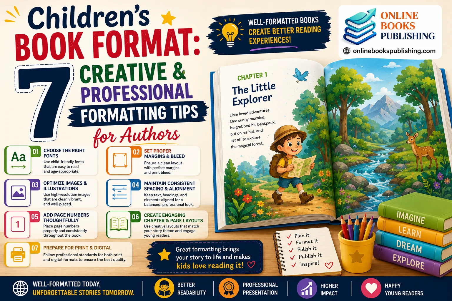
Writing a good children’s book is more than just a good story and colorful pictures. A very important, but often neglected detail in getting a children’s book published is selecting the right book format for children. How your book is structured, designed, and presented will significantly impact how children interact with it. The way your book is formatted can make it very enjoyable, engaging, and professional, from the trim size to the font you choose to ensure readability.
Writing a good children’s book is more than just a good story and colorful pictures. A very important, but often neglected detail in getting a children’s book published is selecting the right book format for children. How your book is structured, designed, and presented will significantly impact how children interact with it. The way your book is formatted can make it very enjoyable, engaging, and professional, from the trim size to the font you choose to ensure readability.
If you’re self-publishing a picture book or writing an educational book for early readers, it’s important to understand the fundamentals of children’s book formatting so you can produce a book that looks great and makes a good impression in a crowded children’s publishing market. Structured formatting makes the material easier to read, tells the story, and keeps children’s attention throughout the reading.
This post is the first of a series that will discuss the basics of picture book formatting: choosing the right kind of book, the best size for a picture book, and some child-friendly typography. The following are some essential children’s book format design tips that will help your authors produce books that will captivate your readers, while also pleasing your parents.
This post is the first of a series that will discuss the basics of picture book formatting: choosing the right kind of book, the best size for a picture book, and some child-friendly typography. The following are some essential children’s book format design tips that will help your authors produce books that will captivate your readers, while also pleasing your parents.
Recognize the various formats of children’s books.
But before deciding on layout and the design of your children’s book, you need to familiarize yourself with the many different types of kids’ books. The formatting and length of the text differ across age groups, as they have varying reading skills, attention spans, and visual preferences.
Selecting the right children’s book format is crucial not only for engaging the right audience but also for ensuring your book is accepted by the publishing business.
Selecting the right children’s book format is crucial not only for engaging the right audience but also for ensuring your book is accepted by the publishing business.

From picture books and board books to graphic novels and chapter books, each format is designed for different age groups, reading levels, and learning experiences 🌈👧👦
Understanding children’s book formats helps authors create stories that are more engaging, educational, and enjoyable for young readers.
Board Books
Board Books are geared toward babies and toddlers (ages 0 to 3). The books are bound in thick cardboard pages, so little hands can’t damage them! Board books are usually full of colorful, vivid illustrations and have limited text for very young children.
Board books usually have a format that includes:
A range of small square trims is available.
A safe, rounded corner design for safety
• Large illustrations
• Lots of text per page
The design should be simple, clean, and highly visual. Overly text-heavy pages and text-heavy learning can be overwhelming for toddlers, and cluttered pages can distract them from the story.
Board books usually have a format that includes:
A range of small square trims is available.
A safe, rounded corner design for safety
• Large illustrations
• Lots of text per page
The design should be simple, clean, and highly visual. Overly text-heavy pages and text-heavy learning can be overwhelming for toddlers, and cluttered pages can distract them from the story.
Picture Books
Children’s picture books are among the most widely used children’s books, and are typically written for children ages 4-8. This is the type of story where the pictures are fundamental to the narrative; often, they are as important as the words.
The format of the most popular picture books is as follows:
• Around 24–40 pages
• Full-page illustrations
• Large, easy-to-read fonts
• Balanced white space
The formatting of a picture book is key; the page turns, pacing, and image positioning are integral to the storytelling experience. The illustrations and text are integrated effectively and pleasingly in a well-formulated picture book.
The format of the most popular picture books is as follows:
• Around 24–40 pages
• Full-page illustrations
• Large, easy-to-read fonts
• Balanced white space
The formatting of a picture book is key; the page turns, pacing, and image positioning are integral to the storytelling experience. The illustrations and text are integrated effectively and pleasingly in a well-formulated picture book.
Early Readers
Early reader books are books written to help children learn to read. These books include:
• Short sentences
• Simple vocabulary
• Larger font sizes
Frequent use of illustrations to aid understanding
Formatting should promote confidence in reading. Spacing, typography, and page layout give young readers the opportunity to read without frustration.
• Short sentences
• Simple vocabulary
• Larger font sizes
Frequent use of illustrations to aid understanding
Formatting should promote confidence in reading. Spacing, typography, and page layout give young readers the opportunity to read without frustration.
Books for Middle-Grades and Chapter Books.
Books become increasingly more text-heavy as children age. Chapter books for 7-10 year olds usually have smaller pictures and are more chaptered, whereas middle-grade novels are mostly text.
These types of books are formatted to be more readable and organized:
• Consistent chapter headings
• Standard margins
• Clear paragraph spacing
• Moderate font sizes
Although illustrations don’t necessarily have to be as prominent in these categories, it is still important to keep a professional children’s book layout for ease of reading and engagement.
These types of books are formatted to be more readable and organized:
• Consistent chapter headings
• Standard margins
• Clear paragraph spacing
• Moderate font sizes
Although illustrations don’t necessarily have to be as prominent in these categories, it is still important to keep a professional children’s book layout for ease of reading and engagement.
Explain how to decide on the optimal size and dimensions of a book.
After deciding on the type of children’s book you’re making, the next step is selecting the book’s size and dimensions. The size of your book will directly affect the visual story, print costs, and the overall reader experience.
First-time authors often don’t realize the significance of trim size. But the correct dimensions can make illustrations more impactful and make your book look better.
First-time authors often don’t realize the significance of trim size. But the correct dimensions can make illustrations more impactful and make your book look better.
These are the most popular trim sizes for children’s books.
The children’s publishing world has a number of common sizes:
8” x 8”
This square shape is very popular in picture books, as it allows for an even distribution of text and pictures. It’s also easy for little kids to hold.
8.5” x 11”
The portrait format is suitable for educational books and stories with many pictures. It provides artists with the freedom to create detailed artwork and dynamic page designs.
10” x 8”
Ideal for illustrations that can be displayed in a panoramic layout and for immersive storytelling. This is the style of many picture books with an adventurous theme that generate page-by-page cinematic sequences.
8” x 8”
This square shape is very popular in picture books, as it allows for an even distribution of text and pictures. It’s also easy for little kids to hold.
8.5” x 11”
The portrait format is suitable for educational books and stories with many pictures. It provides artists with the freedom to create detailed artwork and dynamic page designs.
10” x 8”
Ideal for illustrations that can be displayed in a panoramic layout and for immersive storytelling. This is the style of many picture books with an adventurous theme that generate page-by-page cinematic sequences.
The best size will be determined by your story, illustration style, and audience.
Landscape and portrait layouts are the two options.
The way you orient your book can also affect how you tell your story.
Landscape and portrait layouts are the two options.
The way you orient your book can also affect how you tell your story.
Portrait Layout
Portrait books are longer than they are wide and are typically used to tell a traditional story. This is ideal for scenes with a character focus and vertical images.
Landscape Layout
Landscape books open up a bigger visual area, and are ideal for action scenes, nature drawings, or group shots.
When designing your children’s books, consider the way your illustrations will be used in the book. The flow of the story should be visually supported by your orientation.
When designing your children’s books, consider the way your illustrations will be used in the book. The flow of the story should be visually supported by your orientation.
One of the biggest issues is how to approach your print process as a self-publishing author.
When it comes to your book, it’s vital that you understand print requirements if you are going to self-publish your book. Print-on-demand websites, such as Amazon KDP and IngramSpark, have their own formatting requirements that authors need to adhere to.
Elements of formatting that are important:
• Bleed settings
• Safe margins
• Spine measurements
• High-resolution images
Elements of formatting that are important:
• Bleed settings
• Safe margins
• Spine measurements
• High-resolution images
Images are best at 300 DPI or higher for professional printing. Authors should also ensure that the maximum margins that will prevent their text and illustrations from being cut during printing are provided.
Not only will your reader have a great experience reading your children’s book, but you’ll gain credibility as an author when you present your book in a professional-looking format for kids.
Not only will your reader have a great experience reading your children’s book, but you’ll gain credibility as an author when you present your book in a professional-looking format for kids.
The use of Child-Friendly Fonts and Typography.
One of the most important, but overlooked, elements of formatting children’s books is typography. Young readers require text that is easily recognizable, accessible, and comprehensible.
Font selection can affect readability, and typography can boost confidence and promote understanding.
Font selection can affect readability, and typography can boost confidence and promote understanding.
This web page lists the best fonts for children’s book format.
A few fonts are designed to facilitate early reading development. There are several popular fonts that are used for children’s writing, such as:
• Century Gothic
• Futura
• Arial Rounded
• Sassoon Primary
These fonts have simple letter forms and shapes that are easier for children to process visually.
Do not use fancy or unusual fonts for paragraph text; it may make reading difficult.
• Century Gothic
• Futura
• Arial Rounded
• Sassoon Primary
These fonts have simple letter forms and shapes that are easier for children to process visually.
Do not use fancy or unusual fonts for paragraph text; it may make reading difficult.
The following is a list of recommended spacing and font sizes for your website.
Children’s reading books are usually larger in size than adult reading books. Youth find it helpful to:
• Larger text
• Wider spacing
• Shorter paragraphs
Likeness and darkness levels between text and background to make it easier to read.
The font size in a picture book ranges from 16 to 24 points, depending on the intended age group.
Appropriate line spacing also helps with readability. Young readers can be overwhelmed by the text, and it can also diminish engagement.
• Larger text
• Wider spacing
• Shorter paragraphs
Likeness and darkness levels between text and background to make it easier to read.
The font size in a picture book ranges from 16 to 24 points, depending on the intended age group.
Appropriate line spacing also helps with readability. Young readers can be overwhelmed by the text, and it can also diminish engagement.
The mistakes that typographers should avoid.
There are typographic errors that most novice writers make that make a difference in a reader’s experience.
Common errors include:
Avoid using more than two font styles.
Use of text on top of busy illustrations.
• Choosing low-contrast colors
Use paragraphs with a maximum of seven sentences.
When it comes to professional picture book formatting, consistency is a key factor. Children will find it easier to read the book because the typography style is the same throughout.
Avoid using more than two font styles.
Use of text on top of busy illustrations.
• Choosing low-contrast colors
Use paragraphs with a maximum of seven sentences.
When it comes to professional picture book formatting, consistency is a key factor. Children will find it easier to read the book because the typography style is the same throughout.
The Impact of Fonts on Reading Self-Confidence
Typography not only enhances appearance, but it also helps to foster literacy development. Children who can identify letters and words easily are more confident when reading.
Helpful typography tips:
• Improve focus
• Encourage independent reading
• Reduce reading frustration
• Support comprehension
The following tips on kids’ book design that you can find here are small but very important, which could really make a big difference in your kids’ books.
Helpful typography tips:
• Improve focus
• Encourage independent reading
• Reduce reading frustration
• Support comprehension
The following tips on kids’ book design that you can find here are small but very important, which could really make a big difference in your kids’ books.
Learn the basics for formatting your picture stories.
In children’s books, pictures aren’t just a nice feature of the story; they’re part of the story. In many picture books, the pictures convey emotions, actions, and information that are not fully captured by words.
When using picture books, the text and pictures complement each other. A well-laid-out layout allows children to read the story easily, without losing interest.
How illustrations help to tell the story.
The illustrations lead the reader through the emotional flow of a story. Children read the page using bright colors, facial expressions, and the composition of the scene.
When using picture books, the text and pictures complement each other. A well-laid-out layout allows children to read the story easily, without losing interest.
How illustrations help to tell the story.
The illustrations lead the reader through the emotional flow of a story. Children read the page using bright colors, facial expressions, and the composition of the scene.
For example:
Illustrations can be large and create excitement or drama.
Use of soft colors and open space can induce a sense of calm.
Close-up character images help create an emotional connection.
Illustrations often help children understand stories, so their use should be deliberate and balanced.
One of the most frequent things that new authors do is to have a lot of ideas or text on a single page. This may make your story confusing to follow and less impactful. Instead, introduce a clear focal point on each page that will attract the child’s attention.
Illustrations can be large and create excitement or drama.
Use of soft colors and open space can induce a sense of calm.
Close-up character images help create an emotional connection.
Illustrations often help children understand stories, so their use should be deliberate and balanced.
One of the most frequent things that new authors do is to have a lot of ideas or text on a single page. This may make your story confusing to follow and less impactful. Instead, introduce a clear focal point on each page that will attract the child’s attention.
Professional children’s book layout techniques focus on simplicity and clarity.
This little book is about the significance of page turns in picture books.
The page turn is one of the most compelling devices in image book storytelling. The page turn is carefully designed to inspire anticipation, surprise, humor, or suspense.
The page turn is one of the most compelling devices in image book storytelling. The page turn is carefully designed to inspire anticipation, surprise, humor, or suspense.
For example:
A question can be answered dramatically on the next page.
A Buildup can create an exciting visual Reveal.
Moments of emotion can be more powerful when they occur on separate pages.
The use of page turns helps pace the story and keeps children engaged. That is why most professional writers and illustrators meticulously plan a book’s layout before they even start creating it.
A question can be answered dramatically on the next page.
A Buildup can create an exciting visual Reveal.
Moments of emotion can be more powerful when they occur on separate pages.
The use of page turns helps pace the story and keeps children engaged. That is why most professional writers and illustrators meticulously plan a book’s layout before they even start creating it.
If you are considering the format of your children’s book, think of each page spread as a segment of a visual journey.
Balancing text and images is effective.
A golden rule of formatting a picture book is to maintain a balance between text and visuals. Books for children should not be “text-heavy,” particularly for the younger children.
A golden rule of formatting a picture book is to maintain a balance between text and visuals. Books for children should not be “text-heavy,” particularly for the younger children.
A balanced layout typically will feature:
• Short text blocks
• Generous white space
• Clear illustration placement
• Consistent text positioning
White space is particularly crucial because it helps keep pages from becoming cluttered. It also helps highlight the story’s major elements.
Authors should not put text on very detailed illustrations unless the text is still legible (readable). All text should be readily accessible and easy to read.
• Short text blocks
• Generous white space
• Clear illustration placement
• Consistent text positioning
White space is particularly crucial because it helps keep pages from becoming cluttered. It also helps highlight the story’s major elements.
Authors should not put text on very detailed illustrations unless the text is still legible (readable). All text should be readily accessible and easy to read.
Illustrations complement the text and are well-designed and well-laid out by professionals.
To produce Emotional Engagement by using layout.
The harmonious use of picture and layout helps children to become emotionally engaged in stories. The way the book is laid out can affect how the reader feels during the story, how quickly, and the emotion the reader experiences.
The harmonious use of picture and layout helps children to become emotionally engaged in stories. The way the book is laid out can affect how the reader feels during the story, how quickly, and the emotion the reader experiences.
For example:
Big open shots can evoke a sense of mystery.
Close-ups can heighten tension or excitement.
Emotional comfort can be achieved by soft visual transitions.
Effective children’s books are well-formatted, and the arrangement serves a purpose: to lead the reader through the pages and to inspire the child’s emotions.
Big open shots can evoke a sense of mystery.
Close-ups can heighten tension or excitement.
Emotional comfort can be achieved by soft visual transitions.
Effective children’s books are well-formatted, and the arrangement serves a purpose: to lead the reader through the pages and to inspire the child’s emotions.
It’s one of the most critical tips for writing kids’ books that will make a lasting impression on young readers.
Excessive fussy-pussery by the back door, or is it? Fussy-pussery gone the wrong way around, or is it?
A professional layout provides form, uniformity, and visual cleanliness to a children’s book. A well-written story may seem like a shoddy job done if the formatting seems disjointed or unorganized.
A professional layout provides form, uniformity, and visual cleanliness to a children’s book. A well-written story may seem like a shoddy job done if the formatting seems disjointed or unorganized.
Having a good layout can increase kids’ and parents’ enjoyment of reading, support the story,, and make it easier to read.
The key components of a professional layout.
The key components of a professional layout.
When creating a kids’ book layout, there are some basic components to consider:
Alignment
The text and illustrations should be consistent throughout the book. Correct alignment helps to give pages visual balance and order.
Margins and Safe Zones.
Margins keep text and/or important artwork from being cut off while printing. Safe zones ensure that key features remain visible after cutting.
Margins and Safe Zones.
Margins keep text and/or important artwork from being cut off while printing. Safe zones ensure that key features remain visible after cutting.
Visual Hierarchy
Visual hierarchy guides the reader as to where to start their reading. Titles, dialogue or focal illustrations should stand out naturally as important.
Consistency
Uniform typography, spacing, and illustration placement give the book a neat sense of uniformity and cohesion throughout.
There is a point at which all these come into play, and the book then seems professionally produced and easier to work through.
Here are some common layout mistakes that first-time authors make.
There is a point at which all these come into play, and the book then seems professionally produced and easier to work through.
Here are some common layout mistakes that first-time authors make.
Many first-time authors pay too much attention to story writing and neglect good layout. However, bad formatting can negatively impact the reader’s experience.
The following are some of the common mistakes:
• Inconsistent font sizes
• Uneven text placement
• Overcrowded illustrations
• Insufficient white space
• Poor image resolution
• Ignoring bleed settings
A frequent error is attempting to include all the information on one page. Children’s books should be appealing to the eye, not overwhelming.
Professional children’s book format design does not seek to be super fancy.
• Uneven text placement
• Overcrowded illustrations
• Insufficient white space
• Poor image resolution
• Ignoring bleed settings
A frequent error is attempting to include all the information on one page. Children’s books should be appealing to the eye, not overwhelming.
Professional children’s book format design does not seek to be super fancy.
Best software to format children’s books.
With the current design software, the author can now create a neat layout for his book much more easily. There are a number of tools commonly used in the publishing industry.
Adobe InDesign
Adobe InDesign is probably the most industry-standard professional book format software. It provides complex controls for layout, typography, and print-ready export.
Canva
Easy to use, Canva is great for new authors who may not be much of a designer. It’s packed with templates and easy-to-use drag-and-drop tools.
Affinity Publisher
Affinity Publisher is a cheaper option than InDesign but still offers professional design capabilities.
There are several factors to consider when selecting the software, such as its complexity, cost, and suitability for your skill level.
The importance of consistency in building reader trust.The need for consistency in building reader trust.
Consistency of visuals works well with kids. Children can relax and feel comfortable when reading because they know what to expect.
For example:
Consistency of text placement aids children’s understanding of where to look.
Familiarity is created by repeating visual patterns.
There are several factors to consider when selecting the software, such as its complexity, cost, and suitability for your skill level.
The importance of consistency in building reader trust.The need for consistency in building reader trust.
Consistency of visuals works well with kids. Children can relax and feel comfortable when reading because they know what to expect.
For example:
Consistency of text placement aids children’s understanding of where to look.
Familiarity is created by repeating visual patterns.
The consistent typography makes it easier to read.
These are insignificant bits and pieces, but they do make a huge contribution to ensuring smooth reading.
Professional picture book formatting ensures that all pages are in harmony with the story’s design.
Test printing before publishing is crucial. Test printing before publishing: It is so important!
Authors should always order a hard copy of their children’s book to review the text before publication. A book can be everything on the computer screen, and be nothing when read in print.
Professional picture book formatting ensures that all pages are in harmony with the story’s design.
Test printing before publishing is crucial. Test printing before publishing: It is so important!
Authors should always order a hard copy of their children’s book to review the text before publication. A book can be everything on the computer screen, and be nothing when read in print.
Test printing can be used to find out if there are problems with:
• Incorrect margins
• Text placement problems
• Color inconsistencies
• Low image quality
• Spine alignment errors
When authors read the book in print, they can make final touches before sharing it with readers.
This is an easy trick that can significantly enhance the professionalism of the final project.
• Text placement problems
• Color inconsistencies
• Low image quality
• Spine alignment errors
When authors read the book in print, they can make final touches before sharing it with readers.
This is an easy trick that can significantly enhance the professionalism of the final project.
Some of the most frequent errors in children’s book formatting should be avoided.
Seasoned writers can still make mistakes when it comes to formatting. Knowing about the common errors, however, can help you make a better and more polished book.
Using Too Much Text
Children’s books should be simple and captivating. Younger readers can become overwhelmed by lengthy paragraphs and extensive narration.
Instead:
Instead:
• Use concise sentences
Use paragraphs to structure text
Use illustrations to illustrate part of the story.
Use illustrations to illustrate part of the story.
Choosing Difficult Fonts
Fonts used for decoration may be creative, but a lack of readability. Simple, clear typography should be the primary goal of child-friendly typography.
Ignoring White Space
White space allows for bounce and assists children in focusing on the significant aspects of the story. Tight layouts can be very visually fatiguing.
Using Low-Resolution Images
Unprofessional-looking books may result from smudged or blocky drawings. Illustrations that are smudged or blocky can make a book appear unprofessional. For high-quality printing, high-resolution artwork is a must.
To forget Print Bleed Settings, click the “Forgot” button.
Bleed Settings: settings that will make sure illustrations bleed well to the edges of printed pages. If you don’t address the bleed, you may get white margins on your cut-outs.
If you can steer clear of these common pitfalls, you can make your children’s book look better and be a better book in general.
If you can steer clear of these common pitfalls, you can make your children’s book look better and be a better book in general.
Final Thoughts
The ability to tell a story through pictures and professional formatting is a critical part of the children’s book publishing process. Well-designed layouts help young readers follow the story and give the book a professional, appealing look.
Practicing picture-book formatting, balancing text and illustrations, and keeping the children’s book layout clean will help authors write books that engage children’s imaginations and prompt repeat reading.
Considering these elements during design enhances readability and adds to a design’s emotional connection and storytelling power. These practical kids’ book design tips can make every story book a memorable reading experience for the reader.
Practicing picture-book formatting, balancing text and illustrations, and keeping the children’s book layout clean will help authors write books that engage children’s imaginations and prompt repeat reading.
Considering these elements during design enhances readability and adds to a design’s emotional connection and storytelling power. These practical kids’ book design tips can make every story book a memorable reading experience for the reader.
Optimizing and Designing children’s book format For Publishing Success
It’s only the beginning of the process of publishing a children’s story. After the illustrations, text, and layout are complete, authors must ensure that the book is optimized for printing and online publication. Meanwhile, adding creativity to the design can make it more interesting and memorable to young readers.
Today’s readers read books in a variety of ways: print books, tablets, smartphones, and e-readers. This means that, as an author, you must seek a children’s book publication format that is flexible, professional, and looks good on every platform. Moreover, book design elements such as color, decoration, and accessibility can make books stand out in a crowded market.
This section will discuss how to make your book as publishable as possible, as well as how to use creative book design tricks to make it more readable and interesting. Children’s book design tips for authors will help you to create professional, polished, and appealing children’s books.
Today’s readers read books in a variety of ways: print books, tablets, smartphones, and e-readers. This means that, as an author, you must seek a children’s book publication format that is flexible, professional, and looks good on every platform. Moreover, book design elements such as color, decoration, and accessibility can make books stand out in a crowded market.
This section will discuss how to make your book as publishable as possible, as well as how to use creative book design tricks to make it more readable and interesting. Children’s book design tips for authors will help you to create professional, polished, and appealing children’s books.
Make your book print and digital-ready!
Children’s literature is frequently published both in print and online. The formatting of each version differs to ensure the most readable experience for the reader.
A crucial part of creating a professional book format and a successful sales strategy is understanding how to prepare your book for publishing.
A crucial part of creating a professional book format and a successful sales strategy is understanding how to prepare your book for publishing.
Print Formatting vs Ebook Formatting
The nature of printed books is different from that of ebooks, and so are their formatting requirements.
Print Book Formatting
Printed children’s books are all about the following:
• Fixed layouts
• High-resolution illustrations
• Accurate page alignment
• Professional bleed settings
Physical books are printed exactly as the author designed them, and authors can have complete control over the appearance of each page.
• Fixed layouts
• High-resolution illustrations
• Accurate page alignment
• Professional bleed settings
Physical books are printed exactly as the author designed them, and authors can have complete control over the appearance of each page.
Ebook Formatting
Ebooks are flexible as different devices have different screen sizes. The text and illustrations may change, depending on the situation when reading by:
• Tablets
• Smartphones
• Kindle devices
• Desktop readers
When using digital formatting, the following is typically needed:
• Responsive layouts
• Simplified text positioning
• Optimized image sizes
• EPUB-compatible formatting
When creating a book format for your children, remember to make print and electronic versions easy to read and aesthetically pleasing.
• Tablets
• Smartphones
• Kindle devices
• Desktop readers
When using digital formatting, the following is typically needed:
• Responsive layouts
• Simplified text positioning
• Optimized image sizes
• EPUB-compatible formatting
When creating a book format for your children, remember to make print and electronic versions easy to read and aesthetically pleasing.
The understanding of EPUB and PDF Formatting by him.
The popular publishing formats are EPUB and PDF.

Understanding the difference between EPUB and PDF formatting helps authors create books that are readable, visually appealing, and professionally published for both digital and print audiences
PDF Format
Picture books often have illustrations and text that must be fixed in place, making PDF files the most suitable file format for such books.
Most print-on-demand companies prefer to work with print-ready PDFs because they do not disrupt the page design.
Most print-on-demand companies prefer to work with print-ready PDFs because they do not disrupt the page design.
EPUB Format
EBooks are usually distributed in the EPUB format, which is flexible. In some cases, however, if children’s books contain many images, it will be more difficult to format them in EPUB, as layouts can change.
The authors should thoroughly test EPUB versions to make sure that:
• Images display correctly
• Text remains readable
A natural page flow is achieved.
For print and ebook publishing, you may often need to format the content of your picture book in a separate file, which is a task handled by a professional.
The authors should thoroughly test EPUB versions to make sure that:
• Images display correctly
• Text remains readable
A natural page flow is achieved.
For print and ebook publishing, you may often need to format the content of your picture book in a separate file, which is a task handled by a professional.
Not every author needs to know the following export settings, but they should:
The print quality and reader experience are directly impacted by the export settings. If your settings are incorrect, you may get a blurred image, color problems, or your image may not be accepted for posting on the publishing platform.
The following key technical settings should be considered:
The following key technical settings should be considered:
Image Resolution
Typically, images should be exported at 300 DPI (dots per inch) for high-quality printing.
Color Modes
Print books are printed in CMYK.
• RGB is used for digital screens.
Using the wrong color mode can cause color variations when it’s time to print.
File Types
The majority of publishing platforms will accept:
• PDF for print
• EPUB for ebooks
Promotional graphics: JPEG or PNG
Details are important in creating a professional children’s book format that is industry standard.
Focusing on formatting for Amazon KDP and self-publishing platforms.Specializing in formatting for Amazon KDP and self-publishing platforms.
The formatting requirements for each self-publishing platform (Amazon KDP, IngramSpark, and Barnes & Noble Press) are different.
The authors are recommended to pay special attention to:
• Trim sizes
• Margin settings
• Bleed requirements
• Spine width calculations
• Cover dimensions
If you don’t adhere to the guidelines, you may end up with an upload error or poor-quality print.
Avoid using templates or formatting checklists on platforms without first reading them.
Color Modes
Print books are printed in CMYK.
• RGB is used for digital screens.
Using the wrong color mode can cause color variations when it’s time to print.
File Types
The majority of publishing platforms will accept:
• PDF for print
• EPUB for ebooks
Promotional graphics: JPEG or PNG
Details are important in creating a professional children’s book format that is industry standard.
Focusing on formatting for Amazon KDP and self-publishing platforms.Specializing in formatting for Amazon KDP and self-publishing platforms.
The formatting requirements for each self-publishing platform (Amazon KDP, IngramSpark, and Barnes & Noble Press) are different.
The authors are recommended to pay special attention to:
• Trim sizes
• Margin settings
• Bleed requirements
• Spine width calculations
• Cover dimensions
If you don’t adhere to the guidelines, you may end up with an upload error or poor-quality print.
Avoid using templates or formatting checklists on platforms without first reading them.
Why Proofreading and Final Review are Important
Beautifully designed books that have formatting errors can lose credibility. The authors should check carefully before publication:
• Spelling and grammar
• Text alignment
• Page numbering
• Illustration placement
• Color consistency
If you’re creating a digital version of your book, it’s also advantageous to test it on various devices.
A well-prepared final review will ensure your children’s book layout is professional and easy to read.
• Spelling and grammar
• Text alignment
• Page numbering
• Illustration placement
• Color consistency
If you’re creating a digital version of your book, it’s also advantageous to test it on various devices.
A well-prepared final review will ensure your children’s book layout is professional and easy to read.
Include Creative Design Elements to capture young readers’ attention.
Visually exciting books just appeal to children. Engagement, imagination, and a higher level of interactivity can be achieved through creative design elements.
Great design features can make a book a memorable reading experience.
Some creative elements that help children remember their books.
Many popular children’s books feature fun visual elements that add a dynamic, entertaining element to the pages.
Popular creative design elements are:
• Decorative page borders
• Speech bubbles
• Fun chapter headings
• Interactive visual cues
• Handwritten-style accents
• Themed page decorations
The above elements provide personality to the story and engage children visually.
But there needs to be a balance. Many decorative elements can overwhelm pages and detract from the story itself.
Professional children’s book layout design is designed to maintain the organization of creative features and to ensure that they are well purposeful.
Great design features can make a book a memorable reading experience.
Some creative elements that help children remember their books.
Many popular children’s books feature fun visual elements that add a dynamic, entertaining element to the pages.
Popular creative design elements are:
• Decorative page borders
• Speech bubbles
• Fun chapter headings
• Interactive visual cues
• Handwritten-style accents
• Themed page decorations
The above elements provide personality to the story and engage children visually.
But there needs to be a balance. Many decorative elements can overwhelm pages and detract from the story itself.
Professional children’s book layout design is designed to maintain the organization of creative features and to ensure that they are well purposeful.
How to apply Color Psychology with kids’ books.
Colors elicit feelings, temperaments, and focus. Color is a powerful tool in communicating a story and engaging readers if used well.
For example:
Bright yellow brings happiness and vigor.
Blue can be soothing and comforting.
Red is an attention or urgency color.
Green can symbolize nature and balance.
Younger children are likely to be drawn to bright colors in children’s books.
Also, with picture book formatting, it’s possible to establish the overall tone of the story through consistent color, if it helps.
For example:
Bright yellow brings happiness and vigor.
Blue can be soothing and comforting.
Red is an attention or urgency color.
Green can symbolize nature and balance.
Younger children are likely to be drawn to bright colors in children’s books.
Also, with picture book formatting, it’s possible to establish the overall tone of the story through consistent color, if it helps.
Planning and designing for Accessibility and Inclusivity
Good children’s books must be inclusive and accessible to all. Books can be more enjoyable for children with diverse learning styles and backgrounds when carefully formatted and designed.
Dyslexia-Friendly Formatting
Certain typographic decisions make it easier for children with dyslexia to read.
The following are practices that aid design:
• Larger font sizes
• Clear spacing
• Sans-serif fonts
• High text contrast
Inclusive Illustrations
Children love books that depict characters and experiences that are different from their own. Illustrations are inclusive and draw readers into the story.
Representation can include:
• Different cultures
• Family structures
• Abilities
• Skin tones
• Languages
The design decisions made are inclusive to enhance engagement and learning.
Dyslexia-Friendly Formatting
Certain typographic decisions make it easier for children with dyslexia to read.
The following are practices that aid design:
• Larger font sizes
• Clear spacing
• Sans-serif fonts
• High text contrast
Inclusive Illustrations
Children love books that depict characters and experiences that are different from their own. Illustrations are inclusive and draw readers into the story.
Representation can include:
• Different cultures
• Family structures
• Abilities
• Skin tones
• Languages
The design decisions made are inclusive to enhance engagement and learning.
Interactive Reading Experiences
Children are actively engaged when reading with interactive design elements.
Examples include:
• Search-and-find illustrations
• Repeating visual patterns
• Hidden details
• Interactive questions
• Visual storytelling clues
These features can help grab the reader’s attention and create multiple opportunities for reading.
One of the best kids’ book design tips is to include interactive elements, as they will keep readers coming back for more.
Finding the right balance between being creative and readable.
Visuals and creativity are key, but the most important thing is always readability.
One of the most frequently made errors in children’s publications is the overdesign of the pages with:
• Excessive decorations
• Busy backgrounds
• Too many colors
• Distracting fonts
Children’s book format design is expertly created to not only support the story but also enhance creativity.
The perfect children’s books are both engaging and informative, and are easy to follow.
Examples include:
• Search-and-find illustrations
• Repeating visual patterns
• Hidden details
• Interactive questions
• Visual storytelling clues
These features can help grab the reader’s attention and create multiple opportunities for reading.
One of the best kids’ book design tips is to include interactive elements, as they will keep readers coming back for more.
Finding the right balance between being creative and readable.
Visuals and creativity are key, but the most important thing is always readability.
One of the most frequently made errors in children’s publications is the overdesign of the pages with:
• Excessive decorations
• Busy backgrounds
• Too many colors
• Distracting fonts
Children’s book format design is expertly created to not only support the story but also enhance creativity.
The perfect children’s books are both engaging and informative, and are easy to follow.
Final Thoughts
There’s more to writing a successful book for kids than just good storytelling. To capture their young audience’s attention, authors will need to optimize their books for modern publishing platforms and use creative design elements.
With practice and knowledge of digital and print formatting, and of technical publishing needs, plus some creative thinking and picture book formatting strategies, authors can produce finished books with a professional yet engaging appearance.
Meanwhile, innovative graphics, color theory, ease of use, and interactive design features can make a tale a memorable reading experience.
An intelligently designed children’s book layout will not only make the book easier to read but also deepen the emotional bond between the book and the reader, stimulate imagination, and enhance the book’s quality.
These practical kids’ book design tips will help any author to produce visually appealing, professionally formatted, and successful kids’ books.
With practice and knowledge of digital and print formatting, and of technical publishing needs, plus some creative thinking and picture book formatting strategies, authors can produce finished books with a professional yet engaging appearance.
Meanwhile, innovative graphics, color theory, ease of use, and interactive design features can make a tale a memorable reading experience.
An intelligently designed children’s book layout will not only make the book easier to read but also deepen the emotional bond between the book and the reader, stimulate imagination, and enhance the book’s quality.
These practical kids’ book design tips will help any author to produce visually appealing, professionally formatted, and successful kids’ books.
Frequently Asked Questions (FAQs)

Creating a children’s book can feel overwhelming, especially when it comes to formatting, layout, fonts, illustrations, and publishing standards. That’s why understanding the most common formatting questions is so important for authors and self-publishers
What is the usual shape of a kids’ book?
Children’s books are usually standard books written in the same format as any other book, depending on the target audience and type of book. Picture books have fewer words and more illustrations, and are almost always 24-40 pages. Chapter books have more words and fewer pictures. Common trim sizes include 8” x 8”, 8.5” x 11”, and 10” x 8”. The format should never be different from the audience’s reading level and/or visual requirements.
What is the number of pages in a picture book?
The standard number of pages in a picture book is 32, though most are in the range of 24 to 40 pages. The page count is good for illustrating story pacing, positioning illustrations, and printing. Correct formatting of the picture book will help the story flow across the page and from page to page.
What font size should be used for kids’ books?
Different font sizes based on the reader’s age. Larger fonts (16-24 point) are usually used for children so they can read the text more easily. Simple typography and ample spacing help early readers to read easily. The font selection in a professional children’s book layout design is also an important factor in choosing child-friendly fonts.
Which fonts are best to use in kids’ books?
Common fonts used in kids’ books are:
• Century Gothic
• Arial Rounded
• Futura
• Sassoon Primary
These fonts are clear and simple, and easily identifiable by young readers. Do not use overly fancy fonts in the text; this will make it less readable and distract the children from the story.
• Century Gothic
• Arial Rounded
• Futura
• Sassoon Primary
These fonts are clear and simple, and easily identifiable by young readers. Do not use overly fancy fonts in the text; this will make it less readable and distract the children from the story.
Which software can I use to format children’s books?
There are a number of tools used for formatting and designing picture books:
Professional Publishing: Adobe InDesign program.
Canva is for those looking to create basic layouts. Canva for the beginner.
Print beautifully with Affinity Publisher, an affordable, professional printing solution.
The best software ultimately depends on your design experience, the complexity of the project, and your publishing goals.
Professional Publishing: Adobe InDesign program.
Canva is for those looking to create basic layouts. Canva for the beginner.
Print beautifully with Affinity Publisher, an affordable, professional printing solution.
The best software ultimately depends on your design experience, the complexity of the project, and your publishing goals.
What is the format for a children’s book to be published on Amazon KDP?
When formatting a children’s book for Amazon KDP, an author should:
Use KDP Approved Trim Sizes
•Use the correct bleed and margins
Take high-resolution photos (300 DPI).
Print PDFs that are ready for printing.
Use the KDP cover dimensions guidelines as required.
Before it is published, printing a proof copy is recommended to ensure that the children’s book will look professional.
Use KDP Approved Trim Sizes
•Use the correct bleed and margins
Take high-resolution photos (300 DPI).
Print PDFs that are ready for printing.
Use the KDP cover dimensions guidelines as required.
Before it is published, printing a proof copy is recommended to ensure that the children’s book will look professional.
What’s the difference between a print and an ebook format?
Print books: Have a fixed layout with text and illustrations in precise locations. The ebook formatting is more flexible, as the layout should adapt to the various sizes and features of different devices. Authors may develop a second book layout for print when writing a digital book, ensuring a consistent layout throughout the child’s book across multiple platforms.
What is the significance of white space in kids’ books?
There is plenty of white space, making it easier for children to read and understand the story’s important aspects. Putting too much text on a page can make reading a daunting task for younger readers, and balanced layouts make the reading experience more enjoyable. One of the best kids’ book design tips for enhancing visual storytelling is the proper use of white space.
What are the top children’s book formatting issues?
Here are some of the common formatting errors to avoid:
• Using too much text
• Choosing difficult fonts
• Ignoring bleed settings
• Overcrowding illustrations
• Using low-resolution images
• The spacing and alignment of the text are not consistent.
These mistakes can make a children’s book look less professional and sloppy.
• Using too much text
• Choosing difficult fonts
• Ignoring bleed settings
• Overcrowding illustrations
• Using low-resolution images
• The spacing and alignment of the text are not consistent.
These mistakes can make a children’s book look less professional and sloppy.
What do picture book formatting illustrations look like, and why are they important?
Illustrations are crucial because they enhance the story. Images in many children’s books have emotional significance, pacing, and character development. Good picture book formatting helps to make text and illustrations “play nice” together and present a fun reading experience.
Are the ideas in children’s book format interactive?
It is true that interactive features can help boost readers’ engagement and enhance story recall. Speech bubbles, visual details that are not obvious, decorative borders, and questions that invite children to interact invite them to be genuinely engaged with the text. These creative features are great ideas for kids’ book design in today’s publishing.

We help authors bring their stories to life through professional online book publishing services. From manuscript formatting and cover design to Amazon KDP publishing and global distribution, we make self-publishing simple, affordable, and successful.