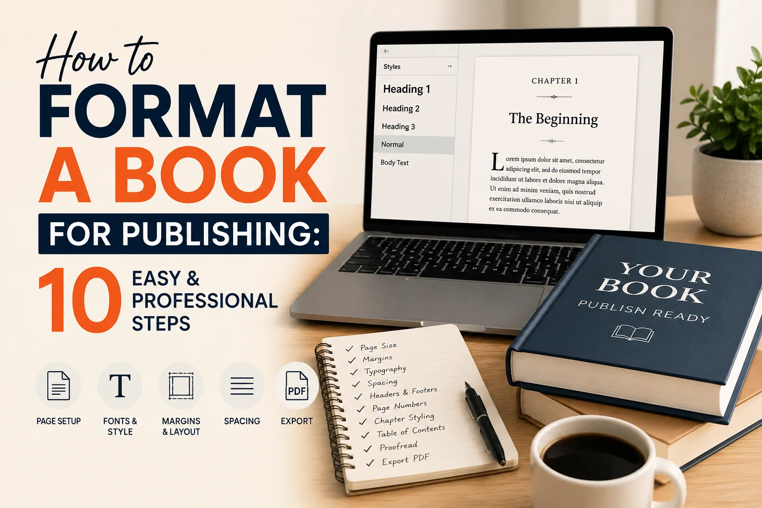
How to Format a Book for Publishing: Foundations & Setup
Formatting the book isn’t just about changing font sizes and line spacing. It includes organizing the text to meet publishing requirements, making it more readable, and preparing it for both print and online publication. Correct formatting helps the reader maintain interest in the text and minimizes errors when it is printed or uploaded. A well-formatted book can make or break a book’s review, reader satisfaction, and sales in the fierce world of publishing.
Authors should familiarize themselves with the basics of formatting before getting to more advanced design elements. Whether it’s selecting the right publishing format or the right typography and page design, every decision impacts the overall reading experience. This guide explains the basic steps that each author needs to take before publishing their manuscript.
Familiarize yourself with the formatting requirements for publishing. Know the formatting requirements for publishing.
Print books have fixed structures because the material is presented on printed pages. Things such as margins, trim size, page titles, and gutes become important. eBooks, in contrast, feature responsive design with layouts that adapt to the device and screen size. This will change significantly from paperback formatting, as this is the approach your formatting needs to take to Kindle or EPUB files.
Popular self-publishing companies like Amazon KDP, IngramSpark, and Barnes & Noble Press offer extensive formatting instructions. These sites specify acceptable trim sizes, bleeds, image resolution, and file formats. Failure to meet these requirements may cause problems with uploads, printing, or the reader experience.
Another important aspect of self-publishing book layout preparation is selecting the right book size. Fiction books are typically printed in sizes such as 5”x8” or 6”x9”, while workbooks, cookbooks, and children’s books may be larger. A trim size will determine not only the number of pages in your book but also how much it will cost to print, so the choice should be made early in the trimming process.
Authors should also be familiar with the different formatting of fiction and non-fiction books. While the layout of a fiction book often focuses on readability and simplicity, the layout of a nonfiction book might include features such as headings, bullet points, tables, charts, footnotes, and references.
If you know what form you need your book to be published in, you can save money on revisions later and produce a manuscript that will be professional and industry standard.
Select the right book formatting software.
Microsoft Word is a commonly used software application for creating documents and is quite user-friendly, making it a good choice for beginner writers. Word provides some basic formatting options for cheap novels and manuscripts. Adobe InDesign is preferred by professional designers for more complex layouts because of its precision and flexibility.
There are several other popular formatting options available, such as Vellum, Atticus, and Scrivener. Vellum is especially popular among self-publishing authors, as it puts professional book formatting for print and eBooks in their hands. Atticus provides cloud-based formatting and easy customization options, while Scrivener helps authors organize their large manuscripts before export.
Every software has its own pros and cons. Microsoft Word is cheap and easy to use, but it can be difficult for more complex formatting. Adobe InDesign offers high-end design features, but it is more complex to learn. Vellum is a great tool for pretty layouts, but it’s only available for Mac.
In addition, the author(s) must choose between doing it themselves or having a professional formatter handle it. While do-it-yourself formatting works for books that are primarily text-based, a professional formatting service can deliver a cleaner, more polished product at a lower cost. An expert can also minimize the risk of formatting mistakes that may affect reviews or sales.
When selecting a formatting software to use, take into account:
• Your publishing goals
• Budget
• Technical skill level
• Book complexity
Please email your library to ensure you receive your print and eBook.
Choosing the appropriate tools at the beginning of the process can save you time and ensure your manuscript formatting guide aligns with current publishing guidelines.
Set Up Proper Page Size and Margins
The first thing you should get right when formatting a book is to make sure you’ve configured the page size and margins correctly. These elements directly impact the readability, printability, and professional look of your book. Also called trim size, the page size indicates the size of your final book. The standard format for a fiction book is 6” x 9” due to its optimal balance of print quality and readability. Smaller sizes provide a compact reading experience; larger sizes are better for textbooks, manuals, or books with many pictures.
But margins are also key, as they provide white space around the text. With proper spacing, pages will not look cluttered, and it will be easier to read. Printed books have gutter margins as well, to provide space around the spine so the text doesn’t run together.
The standard book conventions are usually used for paperback books, such as:
• Outside margins: 0.5” to 0.75”
• Top and bottom margins: 0.75” to 1”
• Gutter margins: 0.75” or more based on the number of pages
If your book has pictures or pictures on every page, you may need bleed settings as well. Bleed is an extra amount of graphics added beyond the cut edge to prevent white borders after printing.
During this stage, many new authors make common formatting errors, such as:
To use a narrow margin.
• Ignoring gutter spacing
• Using different page sizes in the same document
Even though the title is straightforward, long pages containing text are a bad idea.
Clean spacing and visual balance are emphasized in professional book layout design for self-publishing. When a page is correctly formatted, a reader will not be distracted from the content.
Check the layout of your manuscript before sending it in, especially margins, alignment, and spacing, to ensure they are consistent throughout the book.
Employ a professional layout for your presentation.
Typography is a crucial aspect of the reader’s experience of your book. Good writing can be hard to read if the fonts used aren’t consistent or distracting. Good book formatting is based on neat, legible typography that ensures the content flows smoothly.
The decorative details or strokes on the sides of letters are called serifs, and most professionally published print books are typed in a serif font as a way to lead the eye across the lines of text. Garamond, Baskerville, Georgia, and Times New Roman are all popular font types. They’re easily recognized in the publishing world and are comfortable to read.
Body text should be 10-12 point in size for print books. The chapter titles and headings should be larger to create a visual hierarchy. There must be consistency throughout the manuscript.
Line space also impacts readability. Typically, print books are spaced between 1.15 and 1.5 lines, which depends on the font size and the book’s trim size. Typically, paragraphs are indented with a first-line indent, rather than a paragraph space between paragraphs, particularly in fiction formatting.
Authors must refrain from using decorative or highly stylized fonts as they can give the impression of a lack of professionalism and readability. The easiest way to format a professional document is to keep it simple.
Typography consistency includes:
• Uniform heading styles
• Consistent font sizes
• Matching paragraph spacing
• Proper alignment
• Clean chapter openings
By using professional typography, readers will be better engaged, and your manuscript will have a professional look that will meet industry standards.
Now that you have a grasp of these basic formatting rules, you can create a good book that’s ready to be published. The framework you create at this point in the formulation stage, with careful consideration of your publishing format, software tools, layout structure, and typography, forms the backbone for the remainder of the formulation process.
Formatting Chapters and Headings correctly.

One of the most salient aspects of the book’s design is its chapter formatting. Standard and professional chapter formats make pages easier to read and give your book a neat, orderly look. It is important to have a clean structure with a consistent layout throughout the book.
A typical professionally formatted book starts each chapter on a new page. Print books may begin a chapter on the right-hand side, particularly in the case of fiction publishing. Chapter titles should be highlighted and set in larger fonts than the body text, or in bold, or in some way set off from the body text with spacing. But, when it comes to designing chapter pages, simplicity is almost always the best thing to do.
Another key part of a professional book format is headers and footers. Headers may include:
• Book title
• Author name
• Chapter title
Footers are typically used to include page numbers, making it easier for readers to navigate the book. Many printed books have either page numbers at the bottom center of the page or at the outer corners.
Authors are responsible for formatting the front and back matter of the book, as well as the chapters. Front matter is found before the body of your paper; it may contain:
• Title page
• Copyright page
• Dedication page
• Acknowledgments
• Table of contents
• Preface or introduction
Back matter is included at the end of the book after the last chapter and may include:
• About the author
• References
• Bibliography
• Appendix
• Index
• Call-to-action pages
These sections will be properly organized, making your manuscript look professional and in line with publishing guidelines.
It is important to maintain consistency during the layout process. The style, spacing, and alignment of the chapter headings should be consistent throughout the manuscript. One of the most common problems in self-published book layout is inconsistent headings.
Properly formatting chapters and headings makes for a well-balanced manuscript that keeps readers interested throughout.
Master paragraph and space structure

Details like paragraph structure and spacing are important to readability. Even great content can look cramped, muddled, and hard to follow when spacing is poor. Professional formatting is devoted to providing visual breathing room and consistency throughout the book.
Most books are printed with paragraph indents rather than blank lines between paragraphs. This style provides a smooth reading flow and facilitates the reader’s ability to navigate transitions between paragraphs in a natural way. Indentation is particularly useful in fiction books for its traditional, clean look.
Another common formatting error is inserting paragraph indents with tabs or two or more spaces. Rather, authors should rely on formatting in paragraphs within their word processor. This means that you get uniform spacing throughout the manuscript and won’t run into layout issues during the conversion process.
Line spacing is also a factor. There are many factors to consider when printing: tightly spaced documents can make reading difficult, while too much space can be a waste of paper and ink. A line spacing of 1.15 to 1.5 lines per line (usually determined by font size and book size) is used in most professionally formatted books.
The author(s) should also be familiar with the principle of widow-orphan control. A widow is a single line of a paragraph that is left at the top of a page, and an orphan is a single line at the bottom of a page. These layout problems are deviations from the visual consistency and will need to be addressed when the text is finalized.
Scene breaks need to be formatted, too. Fiction books make use of the following for scene changes:
• Blank lines
• Decorative symbols
• Centered asterisks
Ensuring scene breaks are consistent in style helps readers move easily from one scene to the next without confusion.
The essence of manuscript formatting is uniformity, which is emphasized in professional works. Each paragraph, heading, and spacing should be the same throughout the manuscript. The smaller the mistake, the more numerous they can appear, and the more amateurish a book can be.
The spacing will make your article easier to read, more visually pleasing, and more enjoyable for your readers.
Include images, graphics, and visual elements appropriately.
The most critical technical consideration is the image’s resolution. Print books are usually printed at 300 DPI.Print books will often print at 300 dots per inch (DPI). The images could be low-resolution, making the final product look blurry or pixelated, which detracts from professionalism.
Visuals differ in their uses with different types of books:
Nonfiction books can have charts, graphs, and diagrams.
Photography is used in cookbooks.
Illustrations are crucial to children’s books.
Infographics and tables are frequently included in educational books.
If your image is misaligned, your layout will not be clean. Images should be placed in the same style as the rest of the text and should not be offset from it. Enlarged images can make a page unbalanced, and poorly positioned images can confuse readers.
It’s also important for authors to recognize the differences between black-and-white and color printing. Color printing adds a high cost to producing a book, and many self-publishing authors choose grayscale images for their paperbacks while offering full-color versions online.
The most popular image formats are:
The images are saved as PNG for graphics and transparency. Images are saved as PNG (for graphics and transparent backgrounds).
• JPEG for photographs
The TIF file format is designed for high-quality print files.
In the case of eBooks, optimizing images is even more crucial. Over-sized images can cause delays in loading and formatting problems on devices. Any images in the eBook should be responsive and scalable to fit various screen sizes.
Consistency is as important as quality when it comes to visuals. Ensure that all graphics are laid out in the same style, alignment, and spacing throughout the book. When visuals are inconsistent or placed randomly, they may detract from the overall layout design.
Book layout formatting for self-publishing is a perfect way to incorporate visual elements naturally, without overpowering the content.
Make a Professional Table of Contents.
A modern formatting software system can automatically generate a table of contents based on the formatting styles of the text headings. This is much more time-efficient than manually creating a TOC, since page numbers are automatically updated with any layout changes.
The table of contents for a print book should:
• Use clean spacing
• Correctly number pages
• Maintain consistent typography
• Match the overall design of the book
The table of contents is even more important in eBooks, as it serves as a navigation system. Most eBooks require hyperlinked TOCs so readers can click chapter titles and jump to specific parts of the book.
TOC or lack of an updated page number is a pitfall many self-published authors fall into. These errors can frustrate customers and leave a poor impression.
In developing a professional table of contents:
• Practice the use of heading styles
Reduce the use of formatting, styles, and effects.
– Make sure pages are numbered correctly
Check the links to eBooks.
Don’t overfill the page.
You can create TOCs automatically using Word, InDesign, Vellum, and Atticus software, if the headings are set up correctly. This saves time and helps minimize formatting errors.
Using a refined table of contents makes your manuscript easier to navigate and helps build a professional structure. It assists readers in navigating the book more efficiently and supports the flow of print and electronic readers.
A proper organization of chapters, spacing, and formatting of visual elements, and the development of an elegant Table of Contents provide a polished internal structure that promotes reader readability and engagement. These all make up the visual structure of a professionally formatted book and get the manuscript ready for the final stages of publishing.
You can now format your book for eBook publication.
It is a very different process to format a book for eBook publication than to format a print book. Print books have rigid page layouts, whereas eBooks have a flexible layout that adapts automatically to other devices and screen sizes. When it comes to formatting a book for publication, these distinctions are important.
These are the two most popular eBook formats:
• EPUB
• MOBI
EPUB is the standard eBook format that most publishing companies and devices can read, while MOBI was linked to older Kindle devices. Today, Amazon is accepting Kindle EPUB uploads, which will be automatically converted when published.
Re-flowable text is probably one of the most critical eBook formatting concepts. Reflowable formatting makes your material adapt dynamically to screen size, font settings, and device orientation. Users can enlarge text, change the typeface, or adjust the spacing between words, lines, and paragraphs without destroying the layout.
Fixed-layout eBooks are also available (usually only for the following types:
• Children’s books
• Comic books
• Cookbooks
• Image-heavy publications
These have a static page design like a print book, but are less flexible on the smaller screen.
Authors should clean up formatting to have a professional eBook layout. Complex layouts, too many columns, floating images, and manual spacing can cause problems during conversion. Clear and simple formatting structures are preferred by most eBook platforms.
When formatting an eBook, it is important to:
Properly using page breaks between chapters
Both the titles and the articles are consistently formatted with heading styles.
If needed for specific reasons, use readable fonts.
To make images accessible for digital use.To optimize images for digital viewing.
• No manual tab or spacing
It’s also important to compress images correctly when creating an eBook. Larger images can take longer to load and make files larger, causing a poorer experience on mobile devices.
One of the most significant processes involved in eBook formatting is testing. You might have a book that works on one device, but not on another. Authors should test their eBooks on as many screen sizes as possible, such as:
• Kindle devices
• Tablets
• Smartphones
• Desktop reading apps
Self-publishing companies offer preview tools to see how the eBook will look on various devices. The Amazon Kindle Previewer, for instance, is a tool that helps authors find formatting problems before publishing.
Professional eBook formatting will make the eBook easier to read, more user-friendly, and less likely to prompt reader complaints or negative reviews. With so many books being released in the digital publishing market, it is crucial that your eBook is formatted correctly to keep readers engaged and boost your overall sales.
Check for spelling errors and test before publishing.
Proofreading and extensive formatting verification are the last steps of the publishing process. There are also slight formatting problems that can easily be overlooked even after multiple edits, and which won’t be seen until the manuscript is in its final form. If this isn’t done, they could make embarrassing mistakes that detract from the professionalism of your book.
There are significant differences between proofreading and editorial services. When emphasizing grammar or spelling, authors also need to consider the book’s consistency and structure visually.
The most common formatting problems that arise when you are ready to review your paper are:
• Inconsistent fonts
• Incorrect spacing
• Misaligned page numbers
• Uneven margins
• Broken chapter headings
• Missing images
• Extra blank pages
The table of contents links are not correct.
It is strongly advised to order a hard copy of a print book. A written proof enables the author to look back at:
• Margin alignment
• Spine spacing
• Page numbering
• Image quality
• Overall readability
Many formatting issues don’t become apparent until the printed version. Well-balanced in computer format can be crowded or misaligned when printed.
Testing eBooks is also crucial. Before publishing, the author should test the eBook on various devices and applications, to make sure that:
• Hyperlinks work correctly
• Navigation functions properly
• Images display correctly
• Chapters break properly
• Fonts remain readable
An expert manuscript formatting guide will always include a final checklist for publication. The following checklist should be used for the following:
• Font consistency
• Line spacing
• Paragraph indentation
The use of the header and footer.Placing headers and footers.
The accuracy of the table of contents.The correctness of the table of contents.
• Image positioning
• Margin settings
• Page break consistency
• Chapter formatting
• Device compatibility
The authors should do a final spell check once the document has been formatted. When layout adjustments are made, new errors can be introduced, particularly when copying or moving a text section.
A great way to ensure your manuscript is properly formatted is to have beta readers or professionals review it. The eyes of an outsider can sometimes see things differently than those of someone who has worked so long on the project.
The whole point of book formatting is to ensure smooth reading. Technical difficulties, uneven formatting, and navigation should never distract readers. Any formatting should be readable and consistent throughout the document.
The time spent carefully reading and testing will be the difference between an amateurish book and a professional publishing-standard book.
Conclusion
Publishing rules and regulations, selecting the right software package, setting up chapter structure, optimizing typography, formatting eBooks, and checking the final file to ensure everything is in place and ready to go are all part of the process that will help enhance the quality of the finished product. Properly formatted, a book will keep readers reading and make you appear more credible as an author.
Self-formatting or professional formatting requires time to be properly formatted for successful publication. Remember, a clean and polished manuscript will make reading more enjoyable, increase the likelihood of a positive review, help it sell well, and build readers’ trust.
With the proliferation of self-publishing, professionally-formatted books are more noticeable in the crowded market. With these key formatting guidelines in mind, authors can rest assured when creating manuscripts that meet industry standards and ensure a polished presentation on any platform and device.
Frequently Asked Questions (FAQs)
How to format a book for publishing?

It is best to format a book to meet the standards of professional publishers for page dimensions, margins, typography, spacing, and chapter length. The authors should also ensure the manuscript is optimized for print and eBook editions to improve the reading experience.
What software is there that is best for professional book formatting?
Popular formatting software for professional books consists of Microsoft Word, Adobe InDesign, Vellum, Atticus, and Scrivener. Most beginner users enjoy working with Microsoft Word, while those creating more sophisticated layouts and customizations find Adobe InDesign easier to use.
What is the best way to self-publish a book?
To format a book for self-publishing, you need to:
• Select the appropriate size trim
• Use correct margins and gutters
• Use professional fonts
• Format chapters consistently
Create a table of contents.
Optimize the file for print and eBook platforms, including Amazon KDP.
What size letter should I use for a book manuscript?
Professionally formatted books generally use 10pt to 12pt for body text. Common fonts such as Garamond, Georgia, Baskerville, and Times New Roman make a print book easier to read.
What are the default margins for books?
Common problems with print books are the following:
• Outside margins: 0.5”–0.75”
• Top and bottom margins: 0.75”–1”
Gutter margins: 0.75” or greater, depending on page number
These settings will ensure readability and prevent text from vanishing in the spine.
What is the difference between print formatting and eBook formatting?
Print formatting is based on a fixed-page design, and eBook formatting is reflowable text that adapts to different screen sizes and devices. eBooks need to be flexible in their structure for Kindle, tablet, and cell phone readers.
Which file format is needed to publish an eBook?
The majority of eBook platforms support EPUB. Kindle-compatible EPUB uploads are also supported on Amazon Kindle and automatically converted to Kindle when published.
Is it necessary for my book to have a table of contents?
Yes, it is very advisable to have a table of contents, particularly for a nonfiction book or eBook. This makes navigation quick and chapter finding easier, and creates a more professional layout.
The value of professional book formatting.
The professional formatting of books is highly significant because it affects how readable and enjoyable they are to read, and how they are perceived. Regardless of good content, poor formatting will result in criticism and reduced sales.
Do I need to hire a book formatter?
If your book includes complex images, charts, diagrams, or design specifications, it’s worth hiring a professional formatter. You can save time and ensure your manuscript meets publishing industry standards with professional formatting services.
What is the minimum quality required for print books?
For printed books, they usually need to be printed at 300 dots per inch (dpi). The images may appear blurry or pixelated when printed.
Where can I do my formatting before I publish?
The authors should:
• Review print previews
• Order proof copies
Search for Test EBooks on Multiple Devices
• Describe fonts, margins, spacing, and page breaks
Check that the links and page numbers in the table of contents are correct.
Error-checking and proofreading during final formatting ensure that errors are removed before publication.

We help authors bring their stories to life through professional online book publishing services. From manuscript formatting and cover design to Amazon KDP publishing and global distribution, we make self-publishing simple, affordable, and successful.