
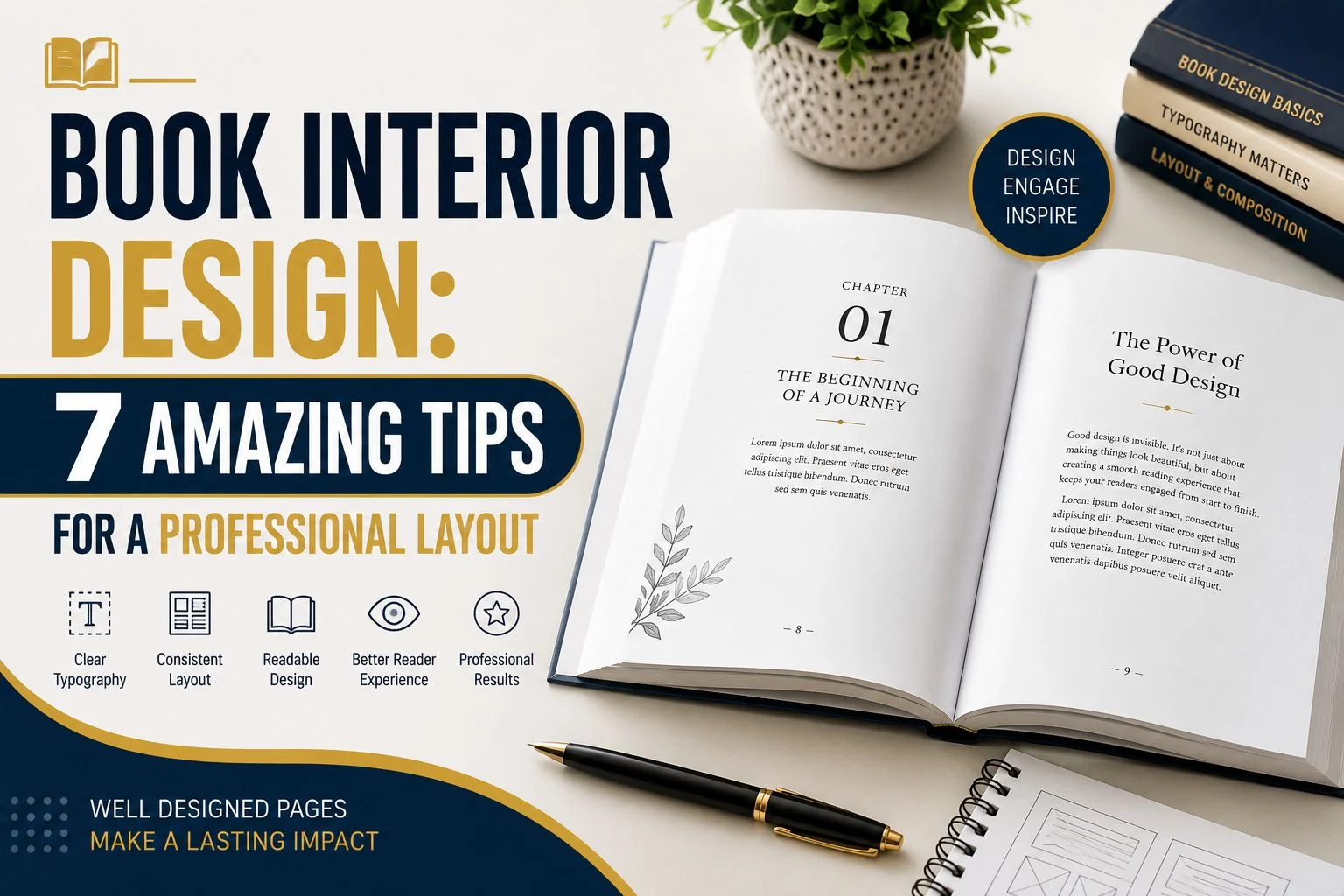
Book Interior Design: 7 Amazing Tips for a Professional Layout
A book is more than its cover and written words. The inside pages also shape the reader’s experience. When the interior looks clean, readers feel more comfortable. They can follow the content without fighting the layout. Good formatting also gives your book a polished appearance. This matters whether you plan to self-publish or work with a publisher.
Many new authors spend weeks creating their manuscript. They may also invest time in designing an attractive cover. However, they sometimes rush through the interior. This can lead to uneven spacing, poor fonts, and awkward page breaks. These problems can make a good book look unfinished. A professional book interior avoids these issues through careful planning.
In this two-part guide, we will cover seven important design tips. Part one focuses on the foundation of a strong interior. We will discuss book size, typography, margins, and spacing. Part two will cover headings, images, chapter openings, and final checks.
What Is Book Interior Design?
Book interior design is the process of designing everything inside a book. It includes text placement, fonts, margins, spacing, headings, and page numbers. It can also include images, tables, charts, captions, and decorative elements. The goal is to make every page easy and pleasant to read.
A good interior does not try to impress readers with complicated effects. Instead, it creates a smooth reading experience. Readers should understand the content without noticing formatting problems. This is one reason professional designers pay close attention to small details. Even a simple page needs thoughtful choices.
Authors often search for interior design books when starting a project. These books can provide useful ideas about typography and page structure. They can also show different approaches to visual balance. However, your book should not simply copy another design. Your layout should match your content, audience, and publishing goals.
A book of interiors can also mean something completely different. It may describe interior spaces, decoration, furniture, or home styling. In publishing, however, book interior design refers to the pages inside a published book. Understanding this difference helps when researching design resources.
Why Is a Professional Book Interior Important?
Your interior is where readers spend most of their time. The cover may attract attention first. The inside pages determine how comfortable the reading experience becomes. A poor layout can quickly frustrate readers. A clean layout allows them to focus on your message.
Imagine opening a book and seeing tiny text everywhere. The margins are narrow, and paragraphs feel crowded. Headings appear in different styles throughout the book. Page numbers are placed randomly. Even if the writing is excellent, the book may feel unprofessional.
Now imagine another book with comfortable text and balanced pages. Headings are easy to recognize. Paragraphs have enough breathing room. Images are placed carefully. Every chapter follows the same design. The difference is immediately noticeable.
This is why professional interior design matters. It creates trust before readers finish the first chapter. It also shows that you cared about the complete product. Good formatting can make your work feel more polished and reliable.
Many interior design books explain this principle through visual examples. You can learn a lot by comparing professionally designed pages. Look at the spacing between paragraphs. Notice the size of chapter titles. Observe how images interact with written content. These details can help you make better decisions.
Build the Foundation of Your Book Interior

Before adding decorative details, establish the basic structure. A strong foundation makes the rest of the design much easier. Your first decisions should include trim size, margins, fonts, and spacing.
These elements work together. Changing one can affect the others. For example, changing the trim size can change your page count. Changing the font can also change your page count. That can affect printing costs and the overall appearance.
For this reason, avoid designing random pages before making your main choices. Decide on the basic structure first. Then apply those decisions consistently throughout the manuscript.
1. Choose the Right Book Size
Book size is one of the first design decisions you should make. It determines how your content will fit on each page. It also affects the overall appearance of your finished book.
Different types of books often use different sizes. Novels usually need a comfortable reading format. Workbooks may need more writing space. Children’s books may need larger pages for illustrations. Cookbooks may need enough room for recipes and photographs.
Think about your content before choosing a size. Ask yourself how readers will use the book. Will they read it from beginning to end? Will they write notes inside it? Will they study images? Will they carry the book around?
Your publishing platform also matters. Different platforms may support different trim sizes. Always check the current publishing requirements before finalizing your file. This can prevent formatting problems later.
Changing the book size after formatting can create many problems. Text may move to different pages. Images may shift position. Chapter openings may no longer look balanced. Your table of contents may also need updating.
That is why planning the trim size early is so important. Once you choose the size, design your interior around it. This creates a stable foundation for the rest of your work.
How Book Size Affects Page Layout
The same manuscript can look very different at different sizes. A smaller page can create more pages. A larger page can reduce the total page count. However, larger does not always mean better.
Your goal should be comfortable reading. The text should not feel squeezed onto the page. At the same time, large empty areas can make a book look unfinished.
Think about visual balance. Your text should have enough space around it. Images should also have enough room to look clear. Tables should not feel cramped. Every element needs enough breathing room.
This is especially important when creating a home interior book. Such books may contain large photographs and visual examples. The page must provide enough space for these elements. A poor trim size can make beautiful images feel crowded.
2. Select Easy-to-Read Fonts
Typography is one of the most important parts of book interior design. Your font affects both readability and personality. The wrong font can make even excellent writing difficult to enjoy.
For long-form reading, choose a font that feels comfortable. Avoid overly decorative fonts for large blocks of text. Fancy fonts may look interesting in a title. They can become tiring when used across many pages.
Your body font should be clear and consistent. Chapter titles can use a different style when appropriate. Subheadings can also have their own appearance. However, all styles should work together.
Many of the best interior design books use simple typography. Their pages often look elegant without being complicated. This is a useful lesson for new authors. You do not need many fonts to create a professional book.
How Many Fonts Should You Use?

There is no single rule for every book. However, using too many fonts can make your interior look messy. A small typography system is usually easier to manage.
You might use one font for body text. Another font can be used for chapter titles. A third style may work for captions or special notes.
The important thing is consistency. If one chapter title uses a particular style, repeat it everywhere. Readers should quickly recognize the visual pattern.
Your fonts should also match the book’s subject. A serious business book may need a clean appearance. A children’s book can use more playful typography. A poetry book may allow more creative choices.
The design should support the content. It should not compete with it.
Choose a Comfortable Font Size
Font size also affects reading comfort. Text that is too small can make readers tired. Text that is too large can create unnecessary page breaks.
Your chosen font affects how large the text appears. Two fonts at the same size can look completely different. Therefore, do not choose a size based only on numbers.
Create a sample page first. Print it if you are preparing a physical book. Read the page normally and check how your eyes feel.
Ask someone else to read the sample too. Fresh eyes can notice problems you may overlook. This small test can save hours of editing later.
3. Set Professional Margins
Margins are the empty areas around your text. They may seem unimportant at first. However, they have a major effect on the appearance of a book.
Good margins give your text room to breathe. They also protect content from being too close to the edge. Printed books need special attention to the inner margin. This area sits near the binding.
The inner margin is often called the gutter. A thicker book may need more gutter space. If the gutter is too narrow, readers may struggle to read text near the binding.
Your outer, top, and bottom margins also need consistency. Uneven margins can make pages look unbalanced. Consistent margins create a clean visual frame around the content.
Why White Space Matters
White space is not wasted space. It gives readers a visual break. It also helps important elements stand out.
Some new authors try to fill every empty area. They may reduce margins or increase text to avoid blank spaces. This can make pages feel crowded.
Professional design takes a different approach. Empty space can make a page look cleaner. It gives the reader’s eyes somewhere to rest.
Look at high-quality interior design books for examples. Many professional layouts use white space carefully. The pages do not feel empty. Instead, they feel balanced.
The same principle works for a home interior book. A beautiful room photograph needs space around it. Text placed too close to the image can reduce its impact.
4. Use Consistent Paragraph Spacing
Paragraph spacing has a major effect on readability. When paragraphs are too close, pages can look crowded. When they are too far apart, the book can look disconnected.
Choose a paragraph style before formatting the entire manuscript. Then apply it consistently. Do not manually change spacing on random pages.
Line spacing also matters. Text needs enough vertical space for comfortable reading. Extremely tight lines can make paragraphs difficult to follow. Excessive spacing can make pages look strangely empty.
The ideal choice depends on your font, trim size, and genre. Test several options before deciding.
Avoid Manual Formatting Problems
Many authors format books directly in a word processor. This can work, but manual formatting often creates problems. Changing individual paragraphs can lead to inconsistent styles.
Using paragraph styles is a better approach. Create a style for body text. Create another for chapter titles. Add styles for subheadings and special content.
Then you can make changes more easily. If you change your body font later, you can update the style. You do not need to edit every paragraph separately.
This approach also helps maintain consistency. Every chapter can follow the same formatting rules. That creates a more professional result.
How Interior Design Books Can Help Authors
Interior design books can be useful sources of inspiration. They show how professional designers approach typography, spacing, and visual hierarchy. They can also help you understand how different styles work.
You do not need to copy their layouts. Instead, study the reasons behind their choices. Ask why a particular heading is larger. Notice why an image has so much empty space around it. Look at how the designer guides your eyes across the page.
The best design books can teach you to see small details. They help you understand that professional design is often about restraint.
You may also find useful ideas in interior decorating books. These books often demonstrate balance, contrast, spacing, and visual flow. Although their subject is different, some design principles can still inspire book layouts.
For example, a home design book may use balance between photographs and text. You can apply a similar idea inside your own book. The goal is not to copy the style. The goal is to understand the principle.
5. Create a Clear Heading Structure
Headings help readers understand your book quickly. They show where one topic ends and another begins. A clear heading system also makes long content easier to scan. This is especially useful for nonfiction, guides, textbooks, and reference books.
Your main chapter titles should have a strong visual presence. Smaller sections should use a simpler heading style. This creates a clear visual order across your pages. Readers can then understand the structure without much effort.
For example, your chapter title might use a larger font. Your main section heading can use a medium size. Smaller sections can use a bold version of the body font. The exact choices depend on your book’s subject.
The important thing is consistency. Every chapter should follow the same basic pattern. If one heading is centered, similar headings should also be centered. If one chapter title uses a certain font, repeat it throughout the book.
Many interior design books demonstrate this principle very well. You can study how they separate major and minor information. Notice how your eyes naturally move from large headings to smaller ones. This visual flow is called hierarchy.
Create a Simple Visual Hierarchy
Visual hierarchy means showing readers what information matters most. Larger elements usually attract attention first. Smaller elements receive less visual attention.
You can create hierarchy through size, weight, spacing, and placement. You do not need bright colors or complicated graphics. Simple differences can be enough.
Your chapter title should stand out from the body text. Your section headings should be noticeable but not overwhelming. Your normal paragraphs should remain easy to read.
This approach works across many types of books. It can work for novels, educational guides, cookbooks, and home design books. The design changes, but the principle remains the same.
Avoid using too many heading styles. Too many variations can confuse readers. Keep your system simple and repeat it throughout the book.
6. Place Images, Tables, and Graphics Carefully
Images can transform a book’s interior. They can explain ideas, provide examples, and make pages more interesting. However, images need careful placement.
A poorly positioned image can make a professional book look unfinished. It may create strange gaps between paragraphs. It may also push important text onto another page.
Start by checking the quality of every image. Low-quality images may appear blurry in print. Always follow the current technical requirements of your publishing platform.
Image size also matters. Do not stretch an image beyond its original quality. Avoid placing tiny images in large empty areas. Every image should feel intentional.
Keep Images Connected to the Text
Images should support the information around them. Readers should understand why an image appears on the page.
If your book explains a design concept, the related image should be nearby. If you use a chart, introduce it before showing it. If you use a photograph, consider adding a short caption when needed.
This creates a stronger connection between visual and written content.
A home interior book often depends heavily on photographs. Readers may expect large, clear images of rooms and design ideas. In that situation, image placement becomes even more important.
Give photographs enough space to breathe. Avoid placing too much text around them. A strong image can become the focus of a page.
Use Captions Consistently
Captions can provide useful information about images. They can explain what readers are seeing. They can also provide context that may not fit naturally into the main text.
If you use captions, create one consistent style. Use the same font and size throughout the book. Keep the position of captions predictable.
Do not make some captions large and others tiny. Consistency makes the book feel professionally designed.
This same principle applies to tables and charts. Give them clear titles when necessary. Make sure readers understand what each visual element means.
7. Design Professional Chapter Openings
Chapter openings create a strong visual transition. They tell readers that a new section has begun. A well-designed chapter opening can make your book feel more polished.
You do not need complicated graphics. A simple chapter number can create a strong effect. A large title can also provide enough visual interest.
For some books, a small decorative element may work well. For others, a clean and simple design will be better.
Your choice should match the subject of your book. A serious nonfiction book may need a professional appearance. A children’s book may allow more playful elements. A poetry book may benefit from more creative spacing.
The key is to remain consistent.
If Chapter One starts with a certain layout, Chapter Two should follow the same pattern. Readers should recognize the design immediately.
Give Chapter Openings Enough White Space
White space can make chapter openings feel special. Do not squeeze the title against the top edge. Give the chapter number and title enough room.
A chapter opening should feel different from a normal text page. However, it should still belong to the same overall design.
Many of the best interior books use this approach. They create visual breaks without adding unnecessary decoration.
Think about the reader’s experience. After finishing one chapter, they should feel a natural pause. The next chapter should feel like a fresh beginning.
How to Design Special Pages
Some books contain pages that need special treatment. These can include dedication pages, copyright pages, contents pages, introductions, and acknowledgments.
Each page has a different purpose. You should not format every page exactly the same way.
For example, a dedication page may use a simple centered layout. A copyright page usually contains smaller information. A table of contents needs clear alignment and page numbers.
These pages should still match the overall design. Their differences should feel intentional.
Design the Table of Contents Carefully
A table of contents helps readers navigate your book. It should be easy to scan.
Chapter titles should align clearly with page numbers. Section titles should use consistent spacing. Long titles should not create messy lines.
If your book contains many sections, consider using different levels. This can help readers understand the structure.
Always check the final table of contents after completing the interior. Page numbers can change during formatting.
Never assume the original page numbers are still correct.
Book Interior Design for Different Genres
There is no single interior style that works for every book. Your design should match your content.
A novel usually needs a quiet and comfortable layout. Readers may spend several hours reading the pages. The design should not distract from the story.
A textbook needs stronger organization. It may include headings, examples, tables, charts, and notes. Readers need to find information quickly.
A cookbook needs a different approach. Recipes should be easy to scan. Ingredients and instructions should have clear separation. Photographs may also play a major role.
A home interior book can be highly visual. Large photographs may need most of the page. Text can then support the visual examples.
This is why studying interior design books can be useful. You can compare how different genres solve similar design problems.
Common Book Interior Formatting Mistakes

Even experienced authors can make formatting mistakes. Some errors are easy to see. Others may only appear after printing.
One common problem is inconsistent fonts. Another is uneven paragraph spacing. Incorrect margins are also frequent.
Some books have page numbers missing from certain sections. Others have headings placed awkwardly at the bottom of pages.
These mistakes can make a book feel unfinished.
Avoid Too Much Decoration
Decoration can be useful when used carefully. However, too much decoration can overwhelm readers.
Borders, icons, illustrations, and fancy fonts should have a purpose. If they do not improve the reading experience, consider removing them.
Professional design often looks simpler than beginners expect. The goal is not to fill every page with visual elements.
The best interior design books often demonstrate this balance. Their pages may look simple at first. However, careful spacing and typography create a strong visual experience.
Avoid Inconsistent Page Numbers
Page numbers should follow a predictable position. They may appear at the bottom or top of the page. Your choice depends on the design.
Some books use different styles for opening pages. That can work well when done intentionally.
However, random page number placement can look unprofessional. Review every section before publishing.
Also check whether front matter uses different numbering. Some publishing styles use Roman numerals for early pages. Main content may then use standard numbers.
Follow the style that best suits your book and publishing requirements.
Review Your Book Before Publishing
Never send your final interior file directly to print without reviewing it.
First, read through the entire book. Look for obvious formatting problems. Check chapter openings and section breaks.
Next, review every page visually. Look for strange gaps and awkward line breaks. Check images and captions carefully.
Then inspect the page numbers. Make sure they appear correctly throughout the book.
Also review your table of contents. Confirm that chapter names and page numbers match the final file.
Print a Proof Copy
A digital PDF can look perfect on your screen. The printed version may feel completely different.
If possible, order a physical proof before publishing. Hold the book in your hands. Turn the pages naturally.
Check whether the font feels comfortable. Look at the inside margin near the binding. Check image quality and overall page balance.
A proof copy can reveal problems that are difficult to notice digitally.
This step is especially important for authors creating their first book. A small investment in a proof can prevent larger problems later.
How Interior Design Books Can Inspire Your Project

Studying professional examples can improve your design skills. Interior design books can show how designers use space and visual balance.
You can also explore home design books for ideas about image placement. Books about home decor often use photographs and text together. Their layouts can provide useful visual inspiration.
However, inspiration should never mean copying. Create your own visual identity.
Look for ideas that solve problems in your own book. You might discover a better way to present photographs. You may also find a heading style that improves navigation.
The best design books can help you develop your eye. Over time, you begin to notice spacing, alignment, balance, and hierarchy.
Final Book Interior Checklist
Before publishing, review your complete interior carefully.
Check the final trim size. Confirm that margins are correct. Review the gutter and binding area. Make sure fonts are readable and consistent.
Check chapter titles and headings. Review page numbers and headers. Inspect images, tables, and captions.
Review your table of contents. Check special pages such as the dedication and copyright pages.
Then read the book like a normal reader.
Ask yourself whether the pages feel comfortable. Ask whether the design looks consistent. Check whether anything distracts you from the content.
If something feels wrong, fix it before publishing.
Frequently Asked Questions About Book Interior Design
What is book interior design?
Book interior design is the process of designing the pages inside a book. It includes fonts, margins, spacing, headings, page numbers, images, tables, and chapter layouts. A good interior makes the book comfortable and easy to read.
Why is book interior design important?
Professional interior design improves the reader’s experience. It also makes your book look polished and trustworthy. Poor formatting can make even excellent writing feel unfinished.
What should a professional book interior include?
A professional interior usually includes consistent fonts, proper margins, readable spacing, page numbers, clear headings, and balanced layouts. Images and tables should also be placed carefully.
How do I choose the right book size?
Choose a size based on your genre, content, and publishing platform. Novels often use compact sizes, while workbooks and visual books may need larger pages. Always check your publisher’s current size requirements.
What are the best fonts for book interiors?
The best font is one that readers can comfortably read for long periods. Simple and clean fonts usually work well for body text. Decorative fonts are better suited to titles or small design elements.
How much margin should a book have?
Margins depend on the book size, page count, binding, and publishing requirements. The inner margin needs special attention because it sits near the binding. Always check the printer’s current specifications.
Can I design my book interior myself?
Yes, you can design your own interior using tools such as Microsoft Word, Adobe InDesign, Affinity Publisher, or other formatting software. However, complex books may benefit from professional formatting.
What are interior design books?
Interior design books are books about decorating and designing interior spaces. They commonly cover furniture, colors, rooms, layouts, architecture, and home styling. This is different from designing the interior pages of a book.
What is a home interior book?
A home interior book usually focuses on residential spaces and decoration. It may contain photographs, room ideas, furniture suggestions, color schemes, and decorating concepts.
How can interior design books inspire book formatting?
They can provide ideas about visual balance, image placement, spacing, and presentation. You should use them for inspiration rather than copying their designs.
Should every chapter have the same design?
Yes, consistency is usually best. Chapter openings should follow a similar structure throughout the book. This helps readers understand the book’s organization.
How do I make my book interior look professional?
Start with a suitable trim size and readable font. Then create consistent margins, spacing, headings, and page numbers. Review every page and order a proof copy before final publication.
What mistakes should I avoid in book interior design?
Avoid using too many fonts, inconsistent spacing, narrow margins, poor-quality images, random heading styles, and excessive decoration. These mistakes can make a book look unprofessional.
Do images need special formatting?
Yes. Images should have suitable quality and correct placement. They should also fit the overall design. Always follow the technical requirements of your chosen publishing platform.
What are the best interior books for design inspiration?
The best choices depend on your purpose. Look for professionally published books in your genre. Compare their typography, spacing, images, chapter openings, and overall page structure.
Final Thoughts
Creating a professional book interior is not about making every page complicated. It is about making thoughtful choices.
Start with the correct book size. Choose readable fonts. Set comfortable margins and spacing. Then build a clear heading system.
Place images carefully and keep visual elements consistent. Give chapter openings enough space. Finally, review every page before publishing.
Whether you are creating a novel, textbook, workbook, or home interior book, the reader should remain your priority.
A beautiful cover may attract the first click. A professional interior helps keep the reader engaged.
The best interior books understand this balance. They combine good design with comfortable reading. You can achieve the same result with careful planning and consistent formatting.
Your book deserves an interior that reflects the quality of your writing. Take your time, review every detail, and let the design support your words.

We help authors bring their stories to life through professional online book publishing services. From manuscript formatting and cover design to Amazon KDP publishing and global distribution, we make self-publishing simple, affordable, and successful.
